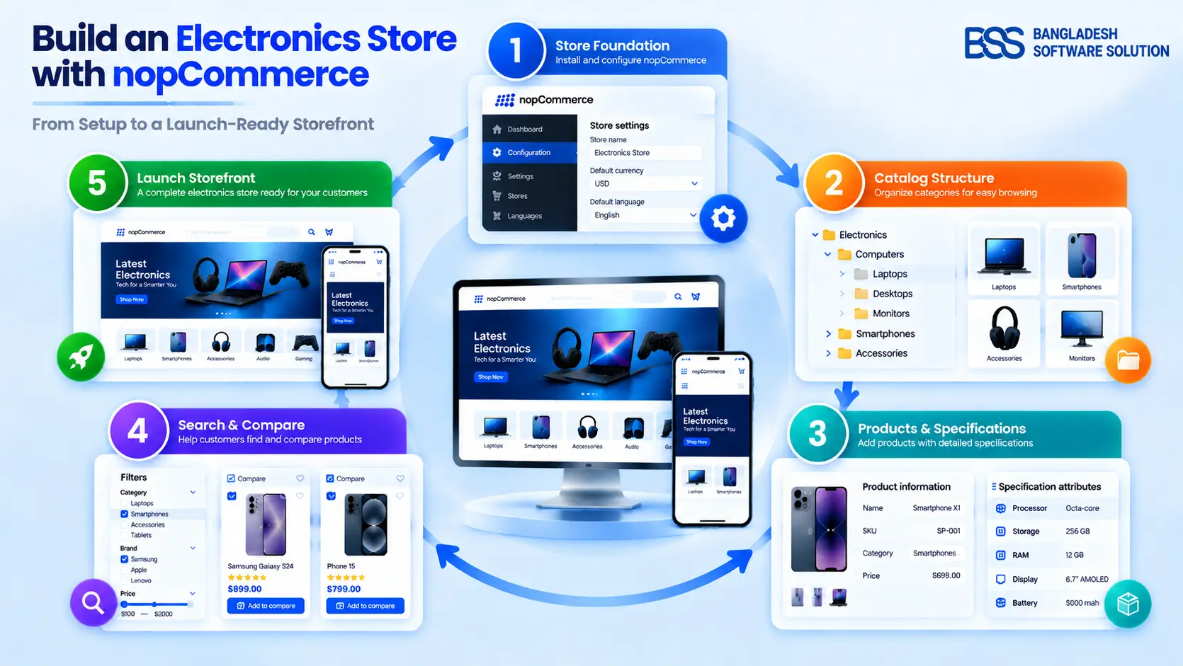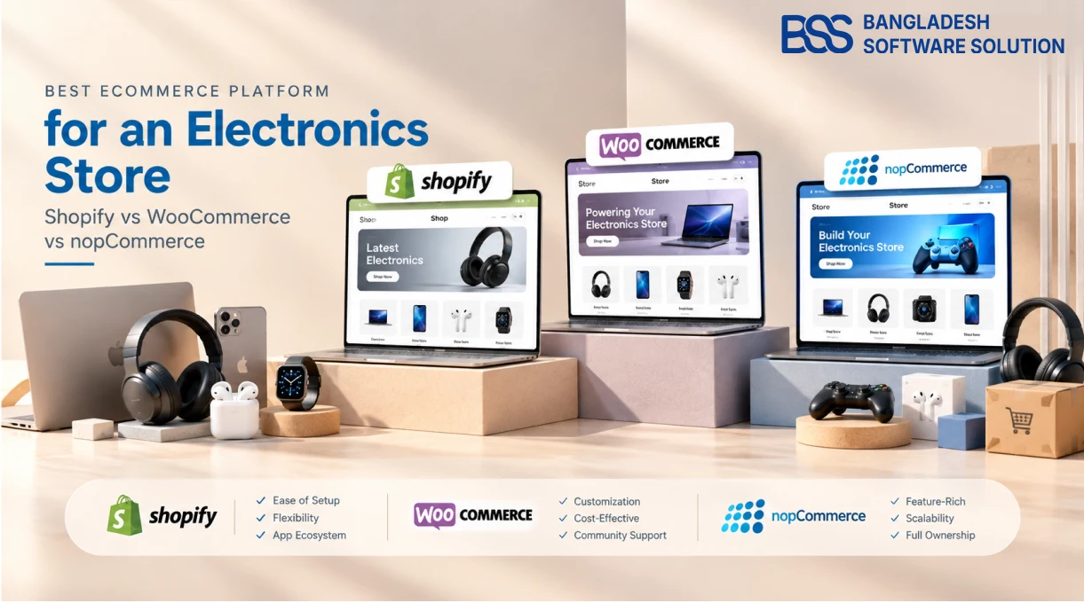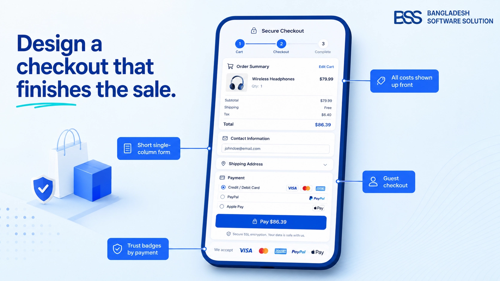
Watch someone shop for a laptop instead of a lamp and the difference shows up fast. Nobody buys a lamp by opening four browser tabs to compare backlight specs. Electronics shoppers do exactly that, every time, and most nopCommerce themes were never built with that behaviour in mind — they were built to look good on a lifestyle brand's homepage and then adapted, category by category, to sell everything from candles to graphics cards.
That works right up until a shopper lands on a product page with eight rows of technical specs jammed into a single description field, no way to set two models side by side, and a hero image heavy enough to make the page hesitate before it loads. None of that is a bug. It is what a theme does when it was designed for a different kind of product.
What the research says: in large-scale usability testing on spec-driven product categories, Baymard Institute found that two-thirds of participants used a comparison feature whenever one was available on the site — yet a meaningful share of sites selling spec-heavy products still don't offer one at all.
That single gap is a fair proxy for the whole problem: electronics and gadget stores need a theme that treats specs, comparisons and page weight as first-class concerns, not as content that gets crammed into whatever layout the theme happened to ship with.
What an Electronics Theme Actually Needs to Get Right
Strip away the marketing language and a theme built for gadgets has to solve three problems a fashion or home-goods theme rarely faces: shoppers compare on numbers, not just looks; product pages carry more images and more data per SKU; and the category itself is more price-sensitive to a slow page than almost any other, because a shopper comparing three retailers has three tabs open at once.
Baymard's benchmarking of the top ecommerce sites also found that only 38% of leading retailers had built a dedicated comparison tool at all, and among the sites that did, usability testing turned up real friction: inconsistent spec formatting between products, and technical terms left unexplained in plain language. In other words, bolting a comparison table onto a theme after the fact is common — and it usually shows.
Speed Is Not a Cosmetic Detail Here
Electronics product pages are naturally heavy: multiple angles, a zoom function, sometimes a demo video, plus a spec table sitting underneath all of it. That combination is exactly what pushes a page past Google's Core Web Vitals thresholds if the theme's underlying code was not built with that weight in mind.
Google's own guidance sets the bar plainly: a page should show its largest content within 2.5 seconds, respond to a tap within 200 milliseconds, and hold still while it loads. Across the web, only 48% of mobile pages currently clear all three — meaning roughly half the ecommerce sites a shopper visits on their phone are already failing this test before a single product loads.
The revenue case is not theoretical. In a joint study with Deloitte, Google measured what happened when mobile retail sites got just 0.1 seconds faster: conversions rose 8.4% and average order value rose 9.2%. A theme carrying unused CSS, unoptimized gallery images and render-blocking scripts is not a design choice — it is a line item working against the store's own numbers every day it stays live.
The Market You're Actually Competing In
None of this is a small niche. US retail e-commerce sales hit $340.2 billion in the second quarter of 2026, up 12.2% year over year according to the Census Bureau, with online now accounting for 17.1% of all US retail sales. The UK is further along that curve: the Office for National Statistics put internet sales at 27.3% of total UK retail in August 2026, a share that has held steady in the high-20s since 2022. Consumer electronics specifically is forecast to keep growing at a mid-to-high single-digit rate through the rest of the decade, which means the shoppers a gadget store is fighting for are not going anywhere — and neither is the competition for their attention.
For a US, UK or Canadian store owner, that translates into a simple fact: the theme isn't decoration on top of the business, it's one of the few levers that directly affects how many of those shoppers convert once they've already clicked through.
Building or Buying for the Category
There are really two paths here. A developer can take a general-purpose nopCommerce theme and retrofit spec tables, comparison logic and image-heavy product pages onto it — which is real, billable work, and still has to be paired with the performance tuning above to avoid trading one problem for another. Or a store can start from a theme that was designed for gadgets and electronics from the ground up, where the product-centric layout, multistore support and SEO structure are the starting point rather than an afterthought.
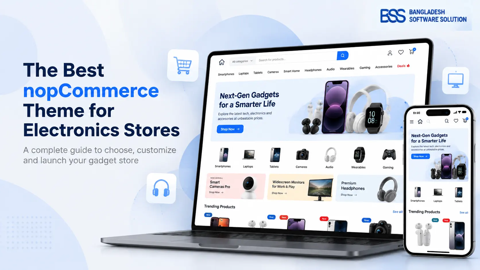
That second path is what NopGadget is built for. It's a fully responsive, multistore nopCommerce theme designed specifically around gadgets, electronics and accessories storefronts, with a product-focused layout instead of a lifestyle-blog one, and it ships with a set of companion plugins so the store's back-end management doesn't lag behind the front-end design.
A theme decision worth making before launch, not after
Comparison tools and spec layouts are far easier to get right in a theme's original page templates than to retrofit later. If your current theme handles specs as plain text, that's the first thing worth testing against a real product catalog before committing to a redesign.
A theme built for a gadget store treats the spec sheet as the product page, not as an afterthought bolted onto one.
BSS Engineering
Whichever path a store takes, the underlying checklist doesn't change. What matters is whether the theme's product template actually supports structured specs, whether a comparison view exists or can be added without custom development, and whether the page stays under Google's speed thresholds once real product photography and copy are loaded in — not the demo content the theme shipped with.
A Checklist Before You Commit to a Theme
Whether you're evaluating NopGadget or anything else, run the theme's demo through this before you buy — most of it takes ten minutes and saves months of workarounds.
Evaluating a theme for an electronics or gadget store
-
Open a real product page in the demo and check whether specs render as a structured table, not a paragraph.
-
Test the comparison feature, if one exists — add two products and confirm the specs actually line up row by row.
-
Run the demo's product page through PageSpeed Insights on mobile, not just desktop.
-
Check how the theme handles a gallery of six or more images plus zoom, since gadget listings rarely ship with just one photo.
-
Confirm multistore support if you plan to run separate storefronts by region or brand.
-
Verify which nopCommerce version the theme supports before you buy, not after.
A nopCommerce Theme Built for Gadgets, Not Retrofitted for Them
Product-centric layouts, full responsiveness across devices and browsers, multistore support, and a bundled set of companion plugins — designed from the start for electronics, gadget and accessories storefronts rather than adapted from a general-purpose template.
Frequently Asked Questions
Final Thoughts
The theme underneath a gadget store is one of the few decisions that touches almost every metric that matters: how long a shopper stays on a product page, whether they can actually compare two models without leaving the site, and whether the page even finishes loading before they give up and open a competitor's tab instead. None of that gets fixed by better copywriting or a bigger ad budget if the underlying template was never built for spec-heavy products in the first place.
If your current theme is fighting your catalog instead of supporting it, NopGadget is worth a look — and if you're weighing it against a custom build or another theme entirely, our team is happy to walk through your specific catalog and tell you honestly which route fits.