Picture the last screen of a purchase. A shopper has compared options, read your reviews, added the item, and tapped through to checkout — every hard part of the sale is already behind them. Their thumb hovers over Place Order. Then the tab closes, and you never find out why.
In our work rebuilding checkout flows for online stores, that final screen is where more revenue leaks than anywhere else on the site — and almost always because of design, not price or product. This guide is about the checkout page itself: how its layout, form fields, guest-checkout path, trust signals, and mobile behaviour add up to either a smooth finish or one more reason to stop. If you also want the wider picture of why shoppers leave and how to win them back after they do, our companion guide on why shoppers abandon their cart covers the recovery side; here we stay focused on the page where the decision is actually made.
Where a Checkout Page Quietly Leaks Revenue
Before changing anything, it helps to see the checkout for what it is: your highest-intent, highest-stakes page. Every visitor who reaches it has already decided to buy — so a design flaw here doesn't cost you a browser, it costs you a customer.
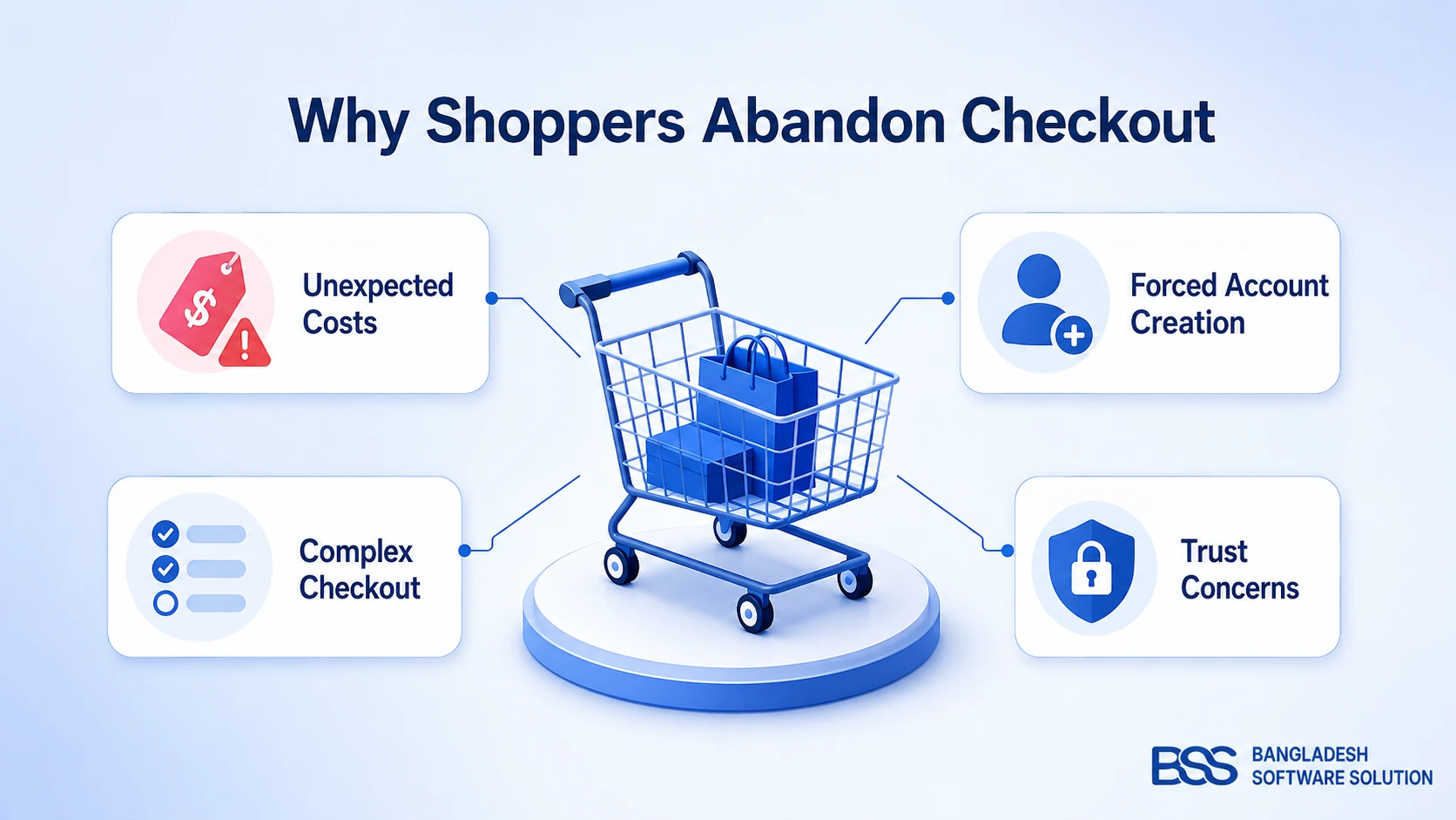
The scale is bigger than most owners expect. According to the Baymard Institute — the most-cited body of checkout usability research in ecommerce — the average online store loses just over 70% of carts before purchase, the average checkout flow runs 5.1 steps and asks for 11.3 form fields, and the single most common abandonment reason, cited by 48% of shoppers, is unexpected extra costs appearing late.
The takeaway: nearly every one of those numbers is a design lever, not a fact of life. You can't make a shopper want your product more at checkout — but you can stop the page from talking them out of a purchase they already wanted.
The rest of this guide walks that page top to bottom, in the order a shopper meets it: layout, then fields, then the guest-and-trust moment, then mobile.
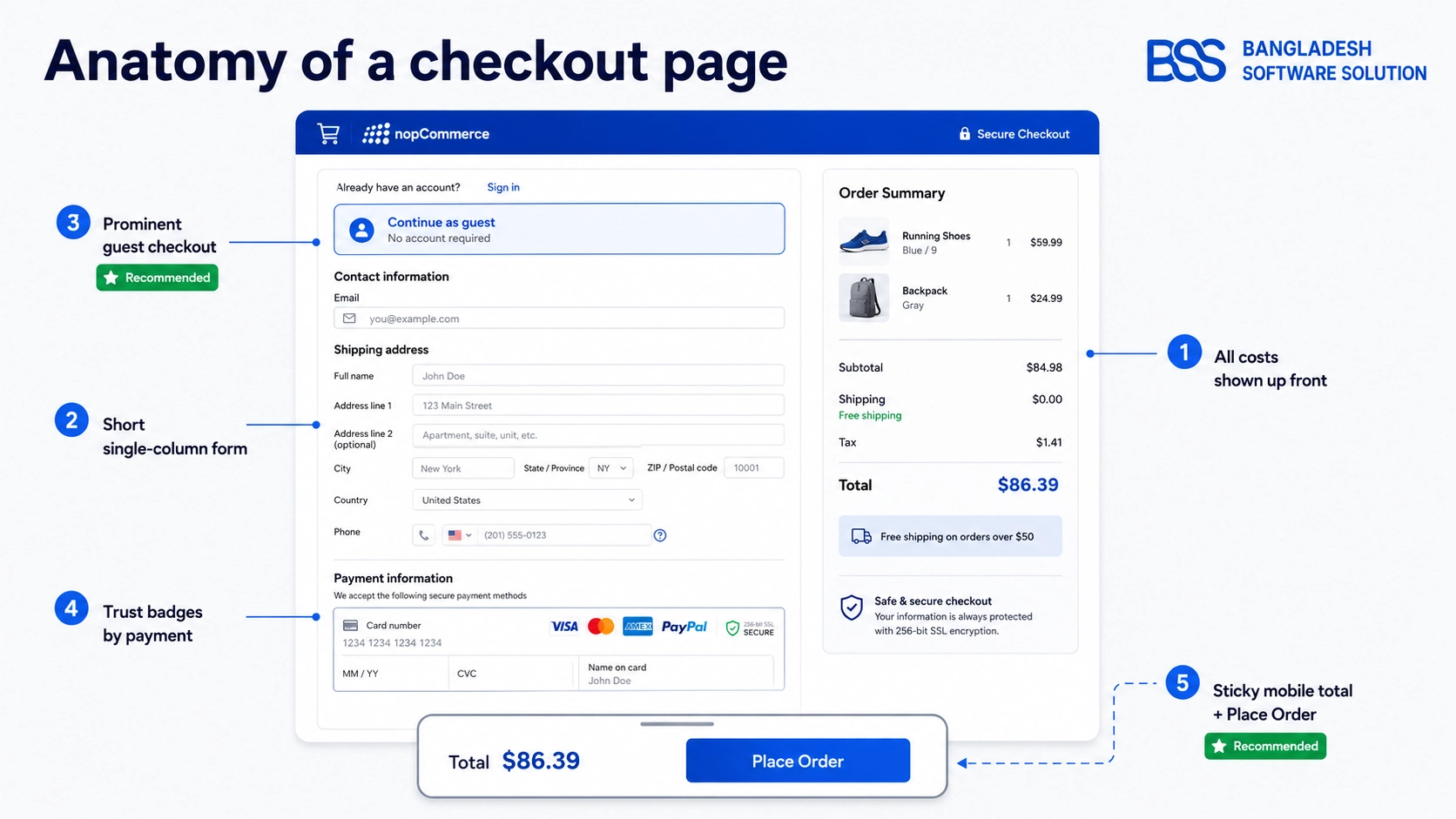
Start With Layout: One Page, Multi-Step, or Accordion
The first design decision is also the one owners argue about most — should checkout live on a single page or several? It's worth resolving early, because everything else sits inside whichever shell you pick.
Here's the honest answer the debate usually skips: Baymard's research repeatedly finds that abandonment is driven far more by specific friction — surprise costs, forced sign-up, a long form, payment doubt — than by whether the form spans one URL or four. Page count is a delivery mechanism, not the cure. Pick the layout that fits your order complexity, then spend your real effort cutting friction inside it.
| Layout | Best when | Watch out for | Net effect |
|---|---|---|---|
| One-page | Simple catalog, few shipping options, a low natural field count | Density on small screens — it needs ruthless field reduction and clear section headers | Lowest friction |
| Multi-step | Complex orders, multiple shipping or delivery choices, longer forms | Every step must save state, and a progress indicator is non-negotiable | More reassuring |
| Accordion | You want a single URL but still need staged, grouped input | Keep completed sections editable, with only one section open at a time | Balanced |
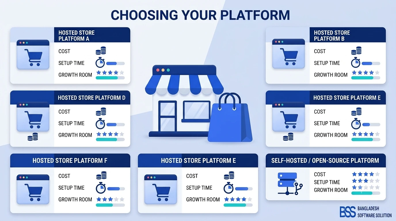
If you haven't committed to a platform yet, this decision is partly made for you: some systems ship a clean, low-field checkout out of the box and others need real customization to get there. Our comparison of the best ecommerce platforms for small businesses notes which ones treat a short, guest-friendly checkout as a default rather than a project.
Design Form Fields Shoppers Won't Fight
Whatever shell you chose, the fields inside it are where checkout is won or lost line by line. Remember Baymard's average of 11.3 fields — and its finding that most flows can be cut to seven or eight without losing anything the order actually needs.
So audit every field against one question: does the order genuinely require it? A company-name box on a consumer store, a separate address-confirmation line, a phone number you'll never call — each is a small tax on a shopper's patience, and the tax compounds.
The Details That Make a Short Form Feel Effortless
Reducing the count is half the work; the other half is making the fields you keep as easy as possible to fill. A few design choices do most of the lifting:
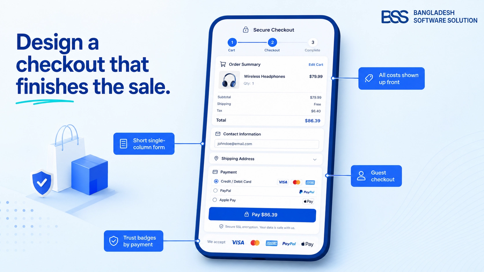
- Single column, top-aligned labels. A shopper's eye should fall straight down the form, never zig-zag across a two-column grid where a field gets missed.
- Right input type and mobile keyboard. An email field should raise the email keyboard; a postcode or card number should raise the numeric one — no hunting for the
@symbol mid-checkout. - Real autocomplete tokens. Correct
autocompleteattributes let the browser fill an entire address in one tap, turning a dozen keystrokes into none. - Inline validation. Confirm a field as it's completed, not after submit — catching a typo where it happened beats a red banner at the top.
Most of this is a few attributes on inputs your store already renders. Getting the type, autocomplete token, and keyboard right costs almost nothing and removes a surprising amount of friction:
<!-- Right type + autocomplete token + mobile keyboard per field -->
<input type="email"  name="email"    autocomplete="email"       inputmode="email">
<input type="tel"    name="phone"    autocomplete="tel"         inputmode="tel">
<input               name="postcode" autocomplete="postal-code" inputmode="numeric">
<input               name="cardnum"  autocomplete="cc-number"   inputmode="numeric">
Pro tip
Never make a shopper retype what they just entered. The fastest way to lose a nearly-complete order is an error screen that clears the form — when validation fails, keep every value they typed, flag only the field that needs attention, and explain the fix in plain words right beside it, not in a banner that makes them hunt.
Guest Checkout, Trust, and the Payment Moment
Now the shopper reaches the two places hesitation peaks: the sign-in wall and the payment field. Handle these two well and you've removed the reasons behind roughly a quarter of all abandonment on their own.
Baymard finds that only about 48% of top online stores offer a clear guest-checkout option — and that forcing account creation is one of the largest single abandonment causes, since a first-time buyer sees it as a password to manage and a mailing list to join in exchange for one purchase. The fix isn't to drop accounts; it's to stop demanding them before the sale.
A checkout page has one job: to get out of the way of a decision the shopper has already made. Every field, step, and badge either helps them finish or hands them a reason to stop.
BSS Engineering
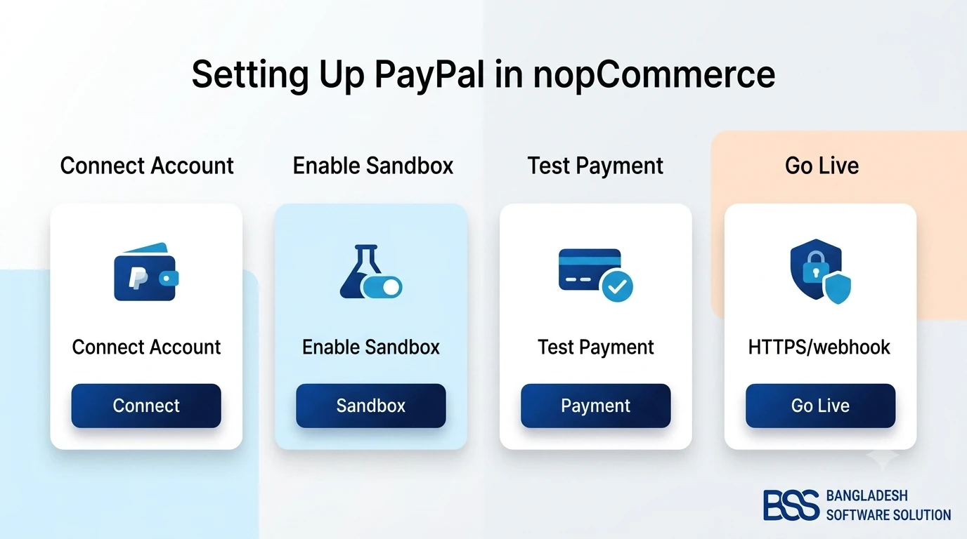
Payment presentation matters just as much as security cues. Show the methods your market actually expects, arranged so the common choice is the easy one — for many regions that means digital wallets and local rails alongside cards, not a single global processor. If you're on nopCommerce and a familiar option like PayPal isn't wired up yet, we've documented setting up PayPal as a payment plugin end to end, including the webhook step that trips up almost every first attempt.
Design for the Thumb: Mobile Checkout
Everything above matters more on a phone, because that's where most of your traffic — and most of your abandonment — now lives. Baymard consistently measures mobile abandonment above desktop, and the reason is physical: a smaller screen, a fiddly keyboard, and a thumb doing the work of a mouse.
Designing for that reality means treating the phone as the primary canvas, not a shrunk-down desktop:
- Big, reachable tap targets. Buttons and fields sized for a thumb (roughly 44px minimum), with the primary action within easy reach at the bottom of the screen.
- A sticky order total and CTA. Keep the running total and the Place Order button visible as the shopper scrolls, so the finish line never disappears.
- Express and wallet buttons first. Offer one-tap wallet payment near the top — for many mobile buyers it removes the entire form.
- One idea per screen. On multi-step mobile flows, resist cramming; a focused screen with a clear next step beats a dense one every time.
One mobile drop-off cause hides outside the form entirely: speed. A checkout that stalls, spins, or times out under load is its own abandonment reason, no matter how clean the design. If your final step slows down exactly when traffic spikes, that's an infrastructure problem, not a layout one — our guide to database indexing and query tuning in nopCommerce covers why order-heavy pages bog down and how to keep them fast.
Turn a Leaky Checkout Into a Finished-Order Machine
From guest-checkout paths and short, autofill-friendly forms to trust-signal placement, wallet and local-payment integration, and a mobile flow that actually converts, our engineers rebuild the checkout a default store won't hand you out of the box. Tell us where shoppers drop off and we'll scope the fix.
Bring It Together: A Checkout Design Audit
None of this needs a redesign to start — most stores we audit are missing two or three of these, not all of them. Run your own checkout against the list below on a real phone, as a first-time guest, and note every place you'd hesitate if it weren't your store.
Checkout Page Design Checklist
-
Shipping, tax, and any fees are shown before the final step — the total is a confirmation, never a surprise.
-
The layout (one-page, multi-step, or accordion) matches your order complexity, with a progress indicator if it's stepped.
-
The form is a single column with the fewest fields you can defend — aim for the seven-to-eight range, not eleven-plus.
-
Fields use correct input types, autocomplete tokens, and inline validation, so autofill and mobile keyboards do the work.
-
A genuine guest-checkout path is at least as prominent as sign-in; account creation is offered after the order.
-
Trust signals and accepted-payment logos sit beside the payment field, not buried in the footer.
-
On mobile, tap targets are thumb-sized, the total and CTA stay visible, and the page stays fast under load.
Whichever items came back red, the fix is rarely dramatic — it's usually a handful of targeted changes to a page you already have. Whether you tune it yourself or bring in help, start with the friction closest to the Place Order button and work outward; that's where a decided buyer is most likely to change their mind.
Frequently Asked Questions
Final Thoughts
Back to that thumb hovering over Place Order. That pause is never random — it's the sum of small design decisions: a cost that appeared too late, a field too many, a forced account, a payment form that didn't feel safe, a button just out of reach on a phone.
Good checkout design removes those reasons one by one until finishing is the path of least resistance. Whether you're tightening an existing flow or rebuilding it from the order summary up, we're glad to look at your specific checkout and tell you honestly where the friction is — because on that final screen, the shopper has already said yes. The job of the design is simply to let them.