The demo looks excellent. The home page has a cinematic banner, product cards animate smoothly, and the color palette feels suitably technical. Then you try to buy a replacement laptop charger. Search cannot find the model number, the filters hide the connector type, the product page buries compatibility, and the comparison table becomes unreadable on a phone.
That is the central risk when choosing an electronics eCommerce theme: buying a visual style before testing whether it supports the decisions electronics shoppers actually make. A useful theme must handle dense catalogs, precise specifications, model-led search, product variants, comparison, compatibility, trust information, and mobile performance without turning every requirement into custom development.
This guide turns those needs into a buyer's checklist. It also gives you a repeatable pre-purchase test, so you can evaluate a live demo with realistic products instead of relying on screenshots and feature claims.
Start With the Shopping Jobs, Not the Home Page
An electronics catalog asks shoppers to resolve uncertainty. They may know a model number but not a category, understand the device but not the compatible accessory, or need to compare several products across memory, storage, ports, warranty, price, and availability. Your theme should make those tasks easier.
A better first question: can a shopper complete the three jobs above on desktop and mobile without guessing?
If the demo cannot prove that, its visual polish is not yet evidence that it is a suitable electronics store theme.
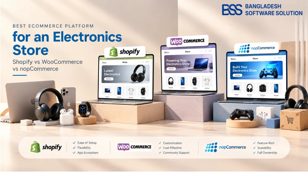
If you are deciding on the commerce engine as well as the storefront, use our separate electronics eCommerce platform comparison. This checklist assumes the platform has already been chosen and focuses on the theme layer.
1. Catalog Discovery: Navigation, Search, and Filters
Electronics catalogs often span categories with completely different decision criteria. Screen size matters for monitors; socket and wattage matter for chargers; storage and memory matter for laptops. A generic filter set copied across every category creates noise and can hide the attributes that actually narrow a purchase.
Navigation should reveal the catalog without becoming a catalog dump
Test the menu with your real top-level categories and at least one deep branch. Category labels should be understandable, touch targets should work on a phone, and the shopper should always know where they are through headings and breadcrumbs. Google recommends crawlable navigation links using standard anchor elements with real href values; a menu that depends entirely on script-driven interactions can make discovery harder for both users and crawlers.
Search must understand identifiers
Try exact and partial searches for a model number, SKU, manufacturer, and common product phrase. Check misspellings and zero-result behavior. A useful result should expose enough context—image, name, model or SKU, price, stock state, and perhaps a key specification—to distinguish similar products. Predictive search is helpful only when it returns the right item quickly.
Filters must be category-specific and recoverable
Test several active filters, not just one. The interface should show applied values clearly, make each one removable, offer a reliable reset, and update counts without losing the shopper's position. On mobile, the filter drawer should preserve selections and make the Apply or View Results action obvious.
Watch faceted URLs during the demo
Google's ecommerce URL guidance warns that faceted navigation can create very large numbers of crawlable URLs. Ask whether the theme and platform keep internal links, canonical URLs, and sitemap URLs consistent, and how filtered combinations are controlled. A beautiful filter panel can still create an SEO maintenance problem.
2. Product Pages: Specifications, Variants, and Confidence
A strong electronics product page answers “is this the right item?” before it asks for the sale. The name, model, price, availability, main variant, and purchase action should be immediately understandable. Detailed specifications can sit lower on the page, but the decisive information cannot be scattered across decorative tabs.
Specifications should be structured, not pasted as prose
Look for grouped, scannable specification tables with consistent labels and units. In nopCommerce, specification attributes can appear on product pages, support category filtering, and participate in product comparison. Product attributes serve a different purpose: they represent selectable options that can affect SKU, price, weight, or stock. A suitable theme must present both roles clearly rather than styling every attribute as the same kind of data.
Variant changes must update the buying state
Select a color, storage size, or other variant and watch the URL, image, price, availability, SKU, and Add to Cart state. Google recommends unique identifiers for variants and supports variant data connected through ProductGroup. Where variants have distinct URLs, those URLs should select the correct variant and show its corresponding information.
Compatibility, warranty, shipping, and returns belong near the decision
An accessory page should state supported devices or connector standards in a form shoppers can verify. Warranty terms, delivery expectations, stock status, and return information should not be hidden behind vague icons. Google can use product structured data for information such as price, availability, ratings, shipping, and returns, but the visible page still needs to communicate those facts accurately.
Images should explain the product
Test zoom, gallery navigation, touch gestures, thumbnails, video placement, and variant-specific media. Product imagery should reveal ports, scale, included parts, and important physical details—not simply repeat the same angle. Confirm that the layout reserves image space so the page does not jump while media loads.
3. Comparison and Merchandising Without Confusion
Electronics shoppers often need a short list before they can make a choice. Comparison should keep the same attributes in the same rows, highlight meaningful differences, and remain usable when products have long technical values. Test it with three or four realistic products, not two perfectly tidy demo items.
Related products should answer a recognizable need: “works with this device,” “higher-capacity alternative,” or “frequently required accessory.” Merchandising blocks that interrupt the specification flow or recommend incompatible items weaken trust. Ask whether recommendations are manually controlled, rule-based, or supplied by a plugin, and whether the theme can label the relationship clearly.
4. Mobile UX and Accessibility: Test the Difficult Screens
Do not judge responsiveness by shrinking the home page. Test the menu, search suggestions, filter drawer, specification table, comparison page, image gallery, variant selector, cart, and checkout at narrow widths. These dense interfaces reveal whether responsive behavior was designed or merely patched.
- Keyboard: reach menus, search, filters, variants, gallery controls, comparison, and purchase actions in a logical order.
- Focus: verify a visible focus state and no keyboard trap. WCAG requires keyboard operability for functionality and a way to move focus away from components.
- Labels: icon-only actions such as compare, wishlist, zoom, and remove need accessible names.
- Touch: buttons, swatches, accordions, and slider controls should be easy to activate without accidental taps.
- Reading: long model names, prices, tables, validation errors, and promotional text must remain legible without horizontal page scrolling.
Ask for the theme demo on a real phone
A desktop browser's narrow preview is useful, but it does not reproduce every touch, keyboard, viewport, or browser behavior. Complete one discovery-to-cart task on an actual phone before buying.
5. Performance and SEO: Verify the Output, Not the Badge
“SEO-friendly” and “optimized” are claims, not test results. Measure several page types with realistic data: home, category, search results, product, comparison, cart, and checkout. A fast empty demo does not predict what happens after large images, reviews, analytics, chat, recommendations, and third-party scripts are installed.
Use Core Web Vitals as field targets
Google defines good user-experience thresholds as Largest Contentful Paint within 2.5 seconds, Interaction to Next Paint at 200 milliseconds or less, and Cumulative Layout Shift at 0.1 or less, evaluated at the 75th percentile. Treat these as ongoing field metrics rather than a one-time theme score.
Image loading needs context
Responsive images can reduce unnecessary mobile downloads by serving an appropriate resource. Below-the-fold media can be lazy-loaded, but Google's guidance says not to lazy-load content that is likely to be visible immediately; delaying the main product or hero image can hurt Largest Contentful Paint. Check that the theme can produce responsive sources, stable dimensions, useful alt text, and sensible loading priority.
Inspect the technical essentials
| Check | What to verify | Failure signal |
|---|---|---|
| HTML hierarchy | One clear page heading and logical section headings | Headings chosen only for visual size |
| URLs | Stable product/category URLs and consistent canonical behavior | Theme interactions generate conflicting or opaque URLs |
| Structured data | Accurate Product, Offer, availability, ratings, and variant relationships where applicable | Hard-coded demo values or markup that disagrees with the page |
| Images | Responsive sources, dimensions, meaningful alt text, and correct loading priority | One oversized file for every viewport or lazy-loaded LCP media |
| JavaScript | Search, filters, galleries, variants, and cart remain responsive under realistic load | Decorative effects delay core shopping actions |
For a deeper test plan, use the nopCommerce performance optimization checklist after the theme is installed with representative catalog data.
6. Ownership: Editing, Compatibility, Support, and Upgrade Cost
A theme becomes part of the store's operating environment. Before purchase, identify what belongs to the theme, what belongs to the platform, and what requires a separate plugin. Search relevance, product comparison logic, feeds, payments, tax, inventory, and recommendations may be styled by the theme without being provided by it.
Questions to ask the theme vendor
- ✓Platform and version: Which exact platform versions are supported, and how are upgrades delivered?
- ✓Feature boundary: Which demo functions are included in the theme, and which require paid extensions or services?
- ✓Content control: Can staff edit menus, banners, landing sections, specification presentation, and merchandising blocks without source changes?
- ✓Compatibility: How does the theme behave with your search, payment, shipping, review, analytics, consent, and marketplace extensions?
- ✓Customization: Is there an upgrade-safe method for CSS, templates, child themes, or overrides?
- ✓License and support: What domains, environments, source files, documentation, response channels, and renewal terms are included?
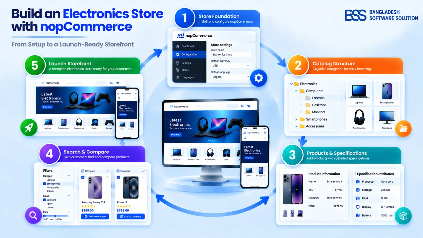
If your store uses nopCommerce, compare these questions with the practical setup steps in How to Build an Electronics Store on nopCommerce. It will help separate storefront presentation from catalog configuration and operations.
Evaluate nopGadget Against Your Own Checklist
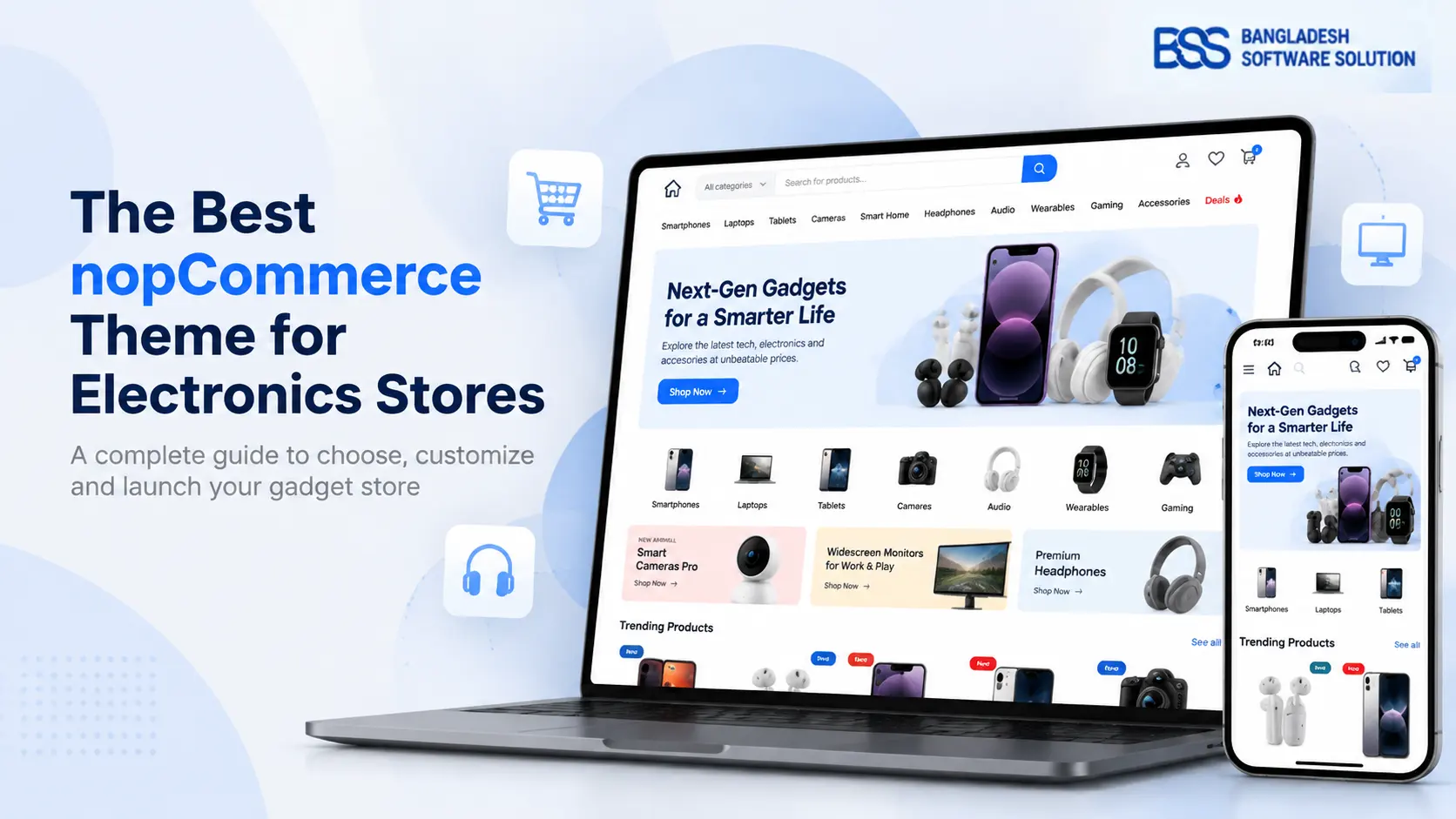
Explore the nopGadget demo and test its electronics-focused catalog, product, comparison, mobile, and content features with the same tasks in this guide. Confirm version and extension compatibility for your store before purchase.
7. Run This Pre-Purchase Theme Test
Use one realistic scenario from start to finish. For example: “Find a laptop under a defined budget, compare two models, confirm memory and ports, add the preferred storage variant, then find a compatible accessory.” Repeat the task on desktop and mobile.
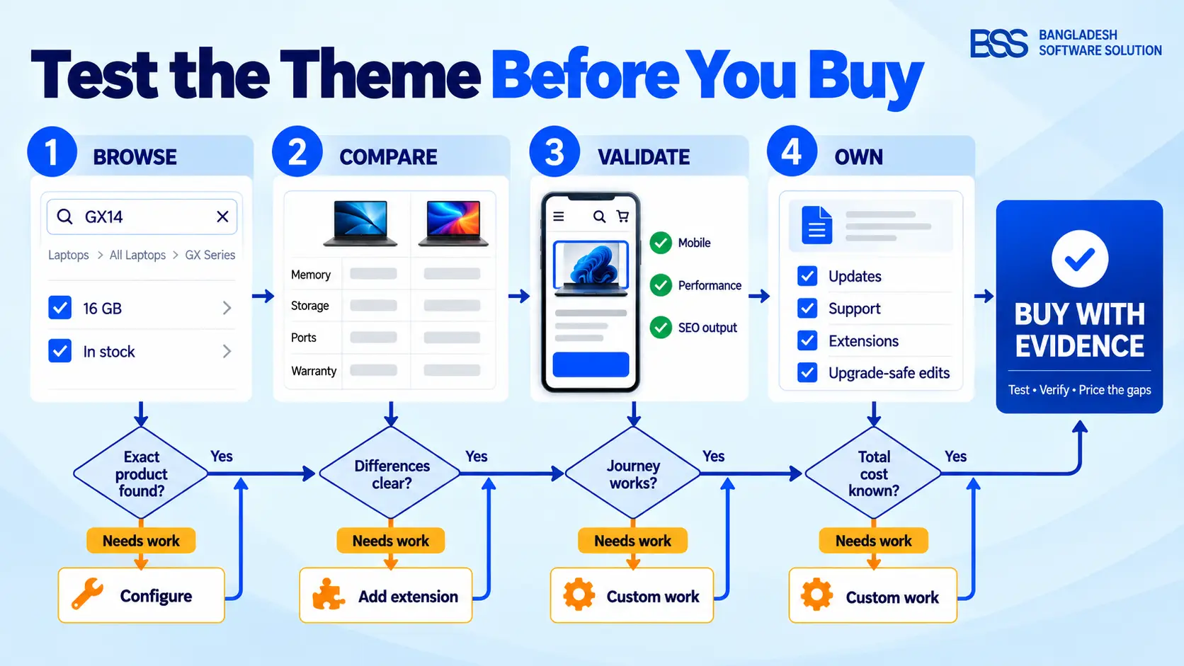
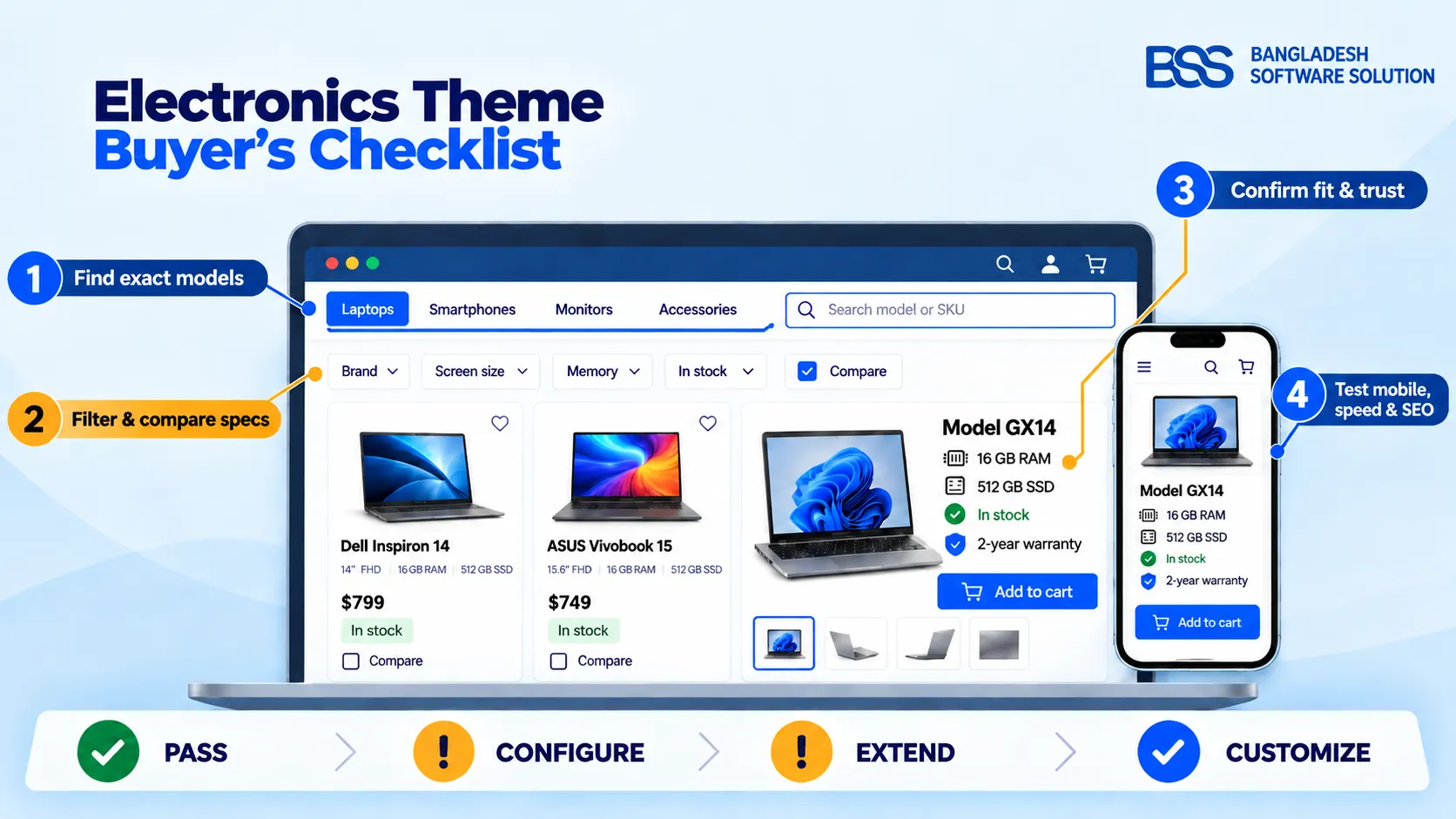
Electronics eCommerce theme buyer's checklist
- 1Search an exact model, a partial model, a SKU, and a misspelling.
- 2Navigate from a broad category to a precise product without relying on search.
- 3Apply, remove, and reset several category-relevant filters on desktop and mobile.
- 4Verify model, SKU, price, stock, warranty, delivery, return information, and decisive specifications.
- 5Switch every meaningful variant and confirm the media, price, SKU, availability, URL, and purchase state.
- 6Compare three realistic products and confirm that differences stay aligned and readable on mobile.
- 7Verify that accessories are explicitly compatible and recommendations have a clear purpose.
- 8Complete menu, search, filters, variants, gallery, cart, and checkout with keyboard and touch.
- 9Measure representative pages with realistic images, data, scripts, and extensions—not an empty demo.
- 10Validate headings, links, canonical behavior, structured data, responsive images, and sitemap consistency.
- 11List every demo feature that requires a separate plugin, license, subscription, or custom service.
- 12Confirm documentation, supported versions, upgrade-safe customization, support scope, and renewal terms in writing.
Score each item Pass, Needs configuration, Needs extension, or Needs custom work. Add the cost and risk beside every non-pass result. This converts a subjective design choice into a comparable buying decision.
Red Flags That Should Pause the Purchase
- The demo shows attractive home pages but no realistic category, comparison, or specification-heavy product page.
- Search cannot find a model or SKU, or the vendor cannot explain which search capability powers the demo.
- The same filters appear in unrelated categories, or mobile filters lose state.
- Variants do not consistently update price, stock, SKU, media, URL, or structured data.
- The main product image is lazy-loaded, content shifts during load, or decorative scripts delay basic interactions.
- Keyboard focus disappears, dialogs trap focus, or controls depend only on color or unlabeled icons.
- The vendor cannot separate included theme features from additional extensions.
- Customization requires editing core theme files with no documented upgrade-safe path.
- Supported versions, license terms, update policy, or support scope are unclear.
One red flag does not always disqualify a theme; it identifies a cost or dependency that must be understood. The mistake is purchasing first and discovering the dependency during implementation.
Frequently Asked Questions
Choose the Theme That Removes Buying Friction
Return to the replacement-charger scenario. The right theme does not merely make the product card attractive. It helps the shopper search the model, narrow the connector and wattage, verify device compatibility, understand stock and warranty, and finish the purchase on a phone without fighting the interface.
Use the buyer's checklist before you pay, document every dependency, and test the entire journey with realistic electronics data. The best choice is the theme that passes the important shopping tasks with the least fragile customization—not the one with the most impressive first screen.