Your ecommerce theme looks polished, and visitors are arriving, but orders are not following. Before paying for a redesign, walk through the store as a customer: can you find a suitable product, understand the offer and complete payment without getting stuck?
A weak sales month does not prove the theme is responsible. Pricing, stock, traffic quality, delivery charges and payment failures also deserve investigation; the useful signs are specific obstacles you can reproduce.
At BSS, we build nopCommerce themes and plugins. This guide separates presentation problems from catalog, platform and integration problems, so you can choose a fix based on evidence.
Start with your funnel: compare product views, add-to-cart activity, checkout starts and completed purchases by device. Use those patterns to decide where to test, rather than treating them as a diagnosis.
1. Pages load slowly, respond late or jump around

The first obstacle may appear before a shopper sees your products: a blank content area, a menu that responds late or a purchase button that moves while images load. These are measurable performance problems, but they do not automatically belong to the theme.
Google’s web.dev guidance separates loading speed, responsiveness and visual stability through Core Web Vitals. Check representative category and product pages, then interact with menus, filters and the cart; a homepage score alone is not enough.
| Metric | What it measures | Google’s good threshold |
|---|---|---|
| Largest Contentful Paint (LCP) | When the main visible content loads | 2.5 seconds or less |
| Interaction to Next Paint (INP) | How quickly interactions produce a visual response | 200 milliseconds or less |
| Cumulative Layout Shift (CLS) | Unexpected movement of visible content | 0.1 or less |
Google assesses these thresholds at the 75th percentile of page views. Use real-user data where available and controlled tests to investigate individual causes; a performance threshold is not a sales forecast.
Confirm the cause, then fix it
- Compare the current theme with a baseline theme on staging, using the same catalog, hosting and plugins. Investigate server response time separately from image, stylesheet and script loading.
- Resize and compress oversized images. Google advises against lazy-loading the main LCP image; reserve space for images and dynamic content to prevent layout shifts.
- Trace slow interactions before removing scripts. Reduce unnecessary JavaScript work and retest the menu, filters and cart after each change.
If the delay comes from infrastructure or database work, changing the design will miss the cause. Follow the nopCommerce performance optimization checklist to investigate the wider stack.
Need help tracing the slowdown? BSS offers nopCommerce performance optimization and theme customization.
Discuss the problem2. The mobile layout fits the screen, but shopping feels difficult
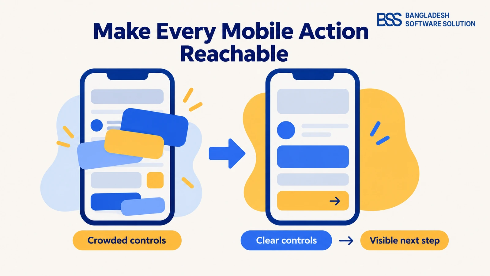
Once a page loads, the next question is whether someone can use it comfortably. A layout that shrinks onto a phone can still have tiny controls, obstructive overlays or a product selector that is difficult to operate.
Baymard’s mobile ecommerce research identifies limited page overview as a recurring usability problem. A shopper sees only part of the interface at a time; an open keyboard further limits what is visible during checkout.
Test a complete purchase on a real phone
- Open the navigation, find a product, change its options and add it to the cart. Note any action that needs repeated tapping, horizontal scrolling or guesswork.
- Open the keyboard in address and payment forms. Check that the active field, its label and any error message remain visible.
- Try the page with cookie notices, promotions and sticky controls present. Check that each can be dismissed and that none covers the next required action.
Keep the primary action visually clear, give controls comfortable spacing and retain visible form labels. W3C’s WCAG 2.2 guidance specifies a minimum pointer target of 24 by 24 CSS pixels, with defined exceptions including spacing; use it as an accessibility baseline, not a promise of comfortable use in every context.

BSS offers custom nopCommerce theme development and customization. If the same obstruction appears across several templates, ask for a shared layout fix and verify it on each affected page.
Compare mobile and desktop funnel data, but check whether the traffic sources and products are comparable before blaming the layout. The strongest evidence is a task that fails on mobile and succeeds after the interface is corrected.
3. Shoppers struggle to find products you actually sell
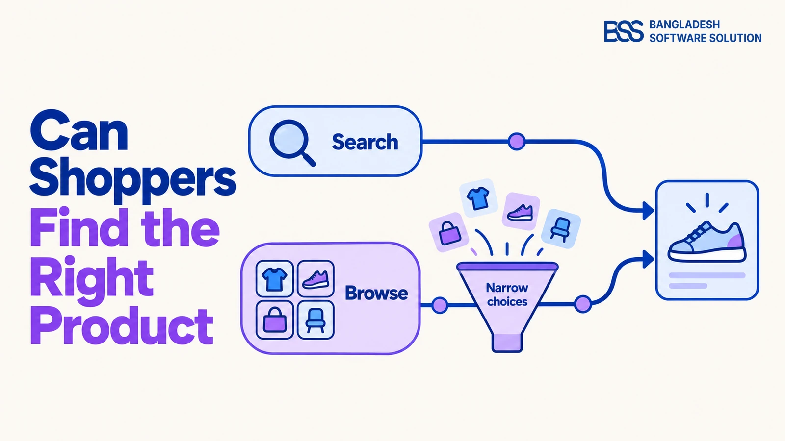
A usable mobile screen still cannot help a shopper who cannot locate the right item. Search that is hard to spot, unclear category names and filters that conceal useful options deserve attention before another homepage makeover.
Baymard’s search research distinguishes queries for exact products, product types, features and other needs. Test those different intentions: a search that finds a model number may still fail when someone describes what the product must do.
Separate visibility from capability: a theme can make search and filters easier to discover. Matching misspellings, interpreting synonyms and returning relevant results also depend on the search implementation and product data.
Audit search and category browsing separately
- Use real search terms from your store’s search logs, where available. Check whether results are relevant, and inspect queries that return nothing despite suitable products being stocked.
- Ask someone unfamiliar with the store to find an item through the menu. Watch where category labels or overlapping categories lead them away from it.
- Apply and remove filters, change the sort order and return from a product page. Confirm the interface makes selected filters and the remaining choices clear.
Fix confusing labels and control placement in the theme. Fix missing attributes, inconsistent product names or inadequate search matching in the catalog or search system; adding another visual filter will not supply data that is absent.
Use the buying questions customers actually ask to choose filters. For electronics, that might mean compatibility or capacity; verify the relevant attributes for your own catalog rather than copying another store’s filter list.
4. Product pages leave essential buying questions unanswered
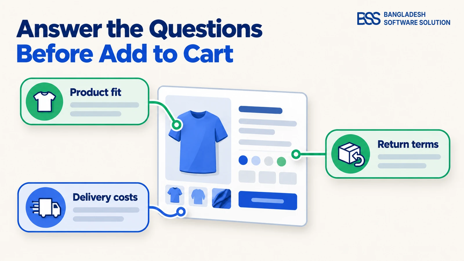
Finding a product is only the start of deciding whether to buy it. If someone cannot tell which variant they selected, what delivery will cost or whether a return is possible, the page has left important questions unresolved.
Baymard’s product-page research recommends making return-policy information discoverable within the main product content. Its shipping-cost research also supports showing an estimate on the product page when possible, before asking shoppers to begin checkout.
Check what a customer can establish without asking support
- Show accurate specifications, clear images and explicit variant labels. Check that changing a variant updates the relevant information and price correctly.
- Explain delivery charges or how they are calculated. If the final cost depends on an address, say so and provide an estimate or calculator where practical.
- Place a concise return summary or a clearly labelled policy link within product content. Include genuine restrictions and keep the full policy accessible.
Missing or hidden? If the information exists but is buried in a collapsed tab or distant footer, adjust the template. If it does not exist, resolve the content or business policy first.
Keep the buying area focused: product choice, price, availability and the next action should be understandable together. Check the actual rendering on a phone as well as a desktop, particularly for long specifications and products with several options.
For an electronics catalog, the electronics theme evaluation guide provides a next step for checking product templates. Evaluate with your own products; attractive demo photography cannot verify that your specifications and variants will be clear.
5. Customers add to cart, then encounter checkout obstacles
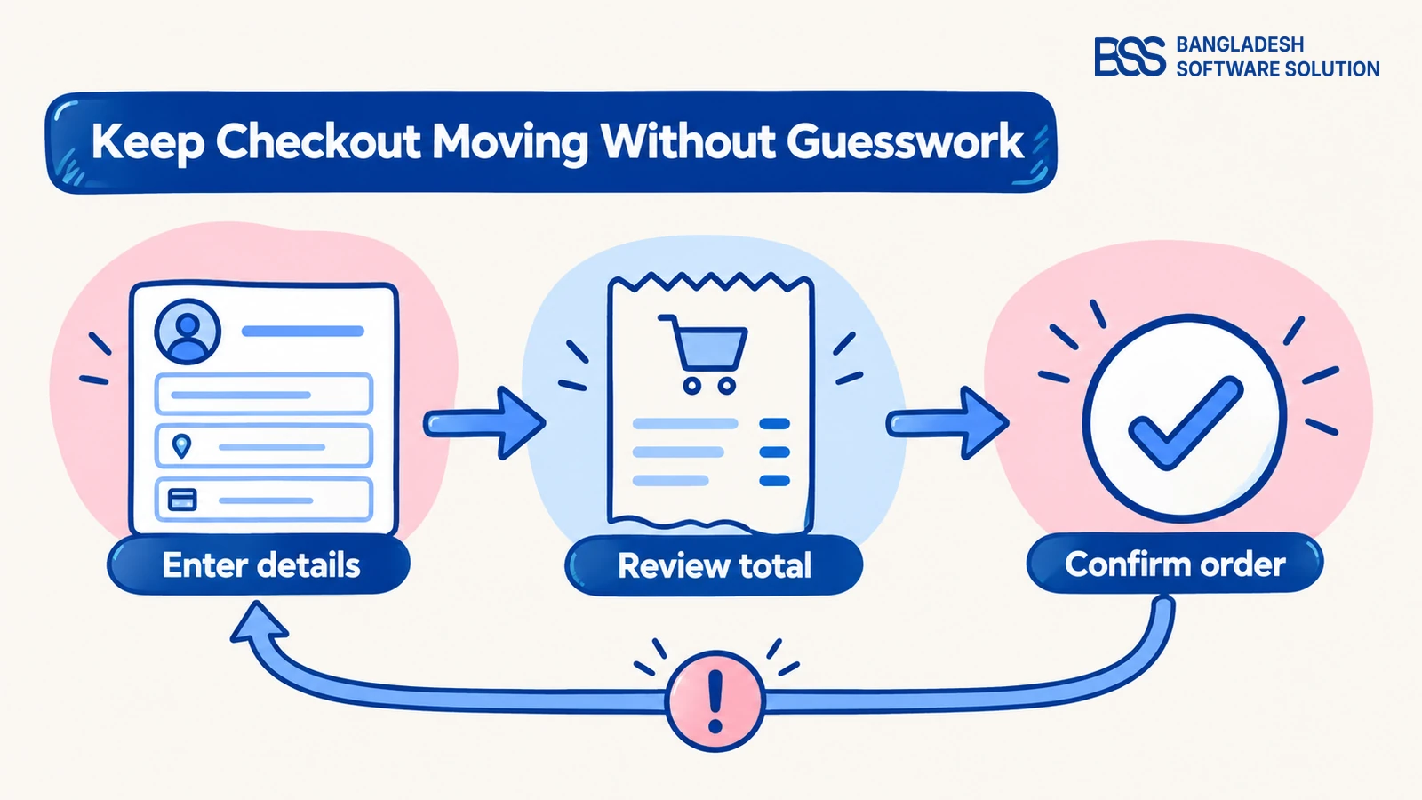
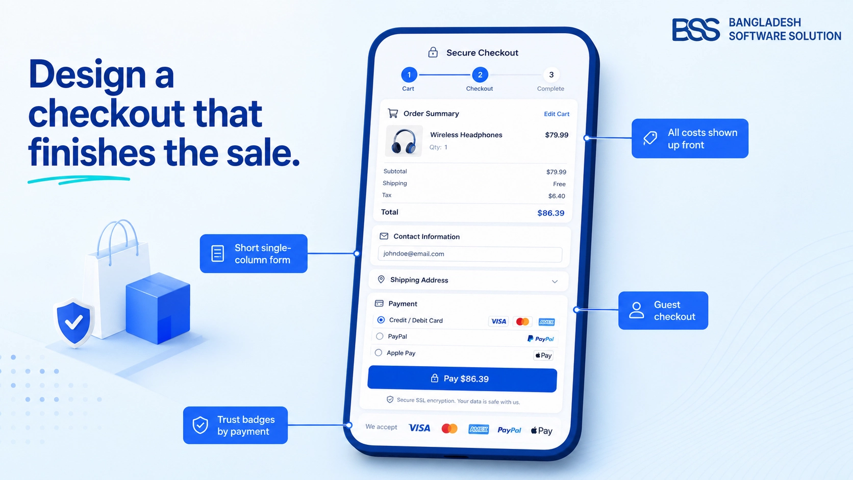
The final test comes after the shopper has chosen a product. Hidden guest checkout, unclear fields or an error that gives no useful recovery path can interrupt the purchase at the point of payment.
Baymard’s checkout testing documents abandonment caused by design and flow problems, including overlooked guest checkout options. That supports investigating the interface, but cart abandonment alone cannot tell you whether the cause is design, unexpected costs or a failed payment.
Follow the order through to confirmation
- Test guest and returning-customer journeys where available. Check labels, required fields and validation, including what happens after an incorrect entry.
- Change the address, delivery option and payment method. Confirm the total updates correctly and the customer can review it before placing the order.
- Use the gateway’s supported test environment to check successful and failed payments. Verify order confirmation and investigate server or gateway errors separately from theme styling.
BSS builds themes and plugins, and offers nopCommerce customization and third-party integration. A checkout change should be tested with the store’s shipping and payment setup, not assessed only by how tidy the form looks.
If these checks uncover problems across mobile layouts, product pages and checkout, compare repairing the existing theme with replacing it. For a gadget or electronics store, BSS’s nopGadget theme is a relevant option: its documentation lists layout and color settings, plus companion plugins for product comparison, picture galleries and one-page checkout.
Those capabilities connect to the problems above, but the bundle is not proof of faster pages or higher conversion. Check supported versions and existing-plugin compatibility, then test it on staging with your catalog, delivery rules and payment methods.
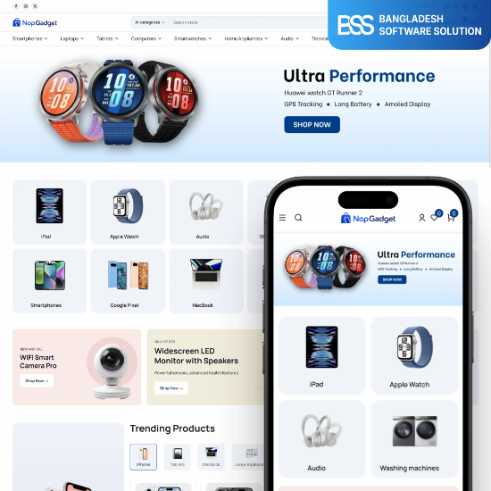
For electronics stores comparing a broader theme change with individual fixes. Review the documented features against your requirements.
Explore the themeBefore switching, save a baseline and define the outcome you will measure. Compare equivalent traffic where possible, record other changes and use a controlled experiment when practical; otherwise, treat before-and-after sales differences cautiously.
Get help fixing the buying journey
BSS offers theme customization, performance optimization and integrations for nopCommerce. Bring the reproducible problem and discuss the implementation it needs.
Frequently Asked Questions
Fix the obstacle before funding the redesign
Return to the store that looked polished but was not producing the orders you expected. The useful next step is a verified explanation: where customers get stuck, which part of the system causes it and whether the proposed fix removes it.
Start with broken purchasing actions, then address the friction your tests uncover. Keep the current theme when a focused repair solves the problem; consider replacement when it better meets verified requirements, and measure the result after launch.
Discuss theme changes, performance work or checkout integrations with BSS. Start with the problem you have confirmed.
Book a free consultation