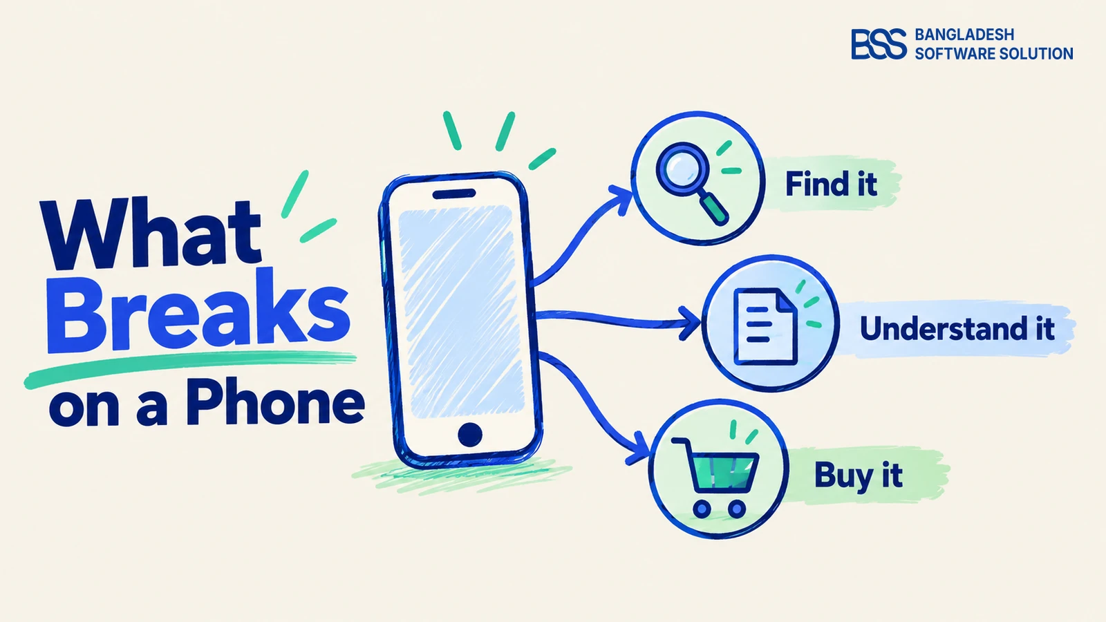
Open your mobile electronics store and try to buy one exact model on a phone. Can you distinguish it from a similar listing, confirm that an accessory fits, select the right version and finish checkout? That purchase journey is a more useful test than whether the homepage looks tidy.
A mobile electronics store needs to keep those decisions clear within a small screen. This guide examines documented mobile ecommerce usability issues and turns them into practical checks for electronics retailers. The examples are test scenarios, not claims that your store already has these faults.
Follow the journey in order: find the product, understand it, buy it, then identify which part of the store needs repair. For nopCommerce owners, that last step also clarifies when a responsive theme is a useful foundation.
1. Finding the right model loses its context
Begin with an exact model search, then try an accessory search for that model. These are different tasks: one asks for a particular item; the other asks which products work with it. A search box that returns loosely related items does not answer either question clearly.
Baymard Institute distinguishes exact searches from compatibility searches in its ecommerce search research. For an electronics catalog, use that distinction to build a test list from actual manufacturer model names and verified compatible accessories. Do not promise compatibility simply because two titles contain the same word.
Next, narrow a category by the attributes that matter for its products. A laptop category might need memory and storage filters; a case category might need supported device models. These are suggested catalog checks: the appropriate filters depend on the products you actually sell and the data you maintain.
Check discovery on a phone
- Keep search and a clearly labelled Filter control easy to find.
- Show selected filters and provide a way to remove them.
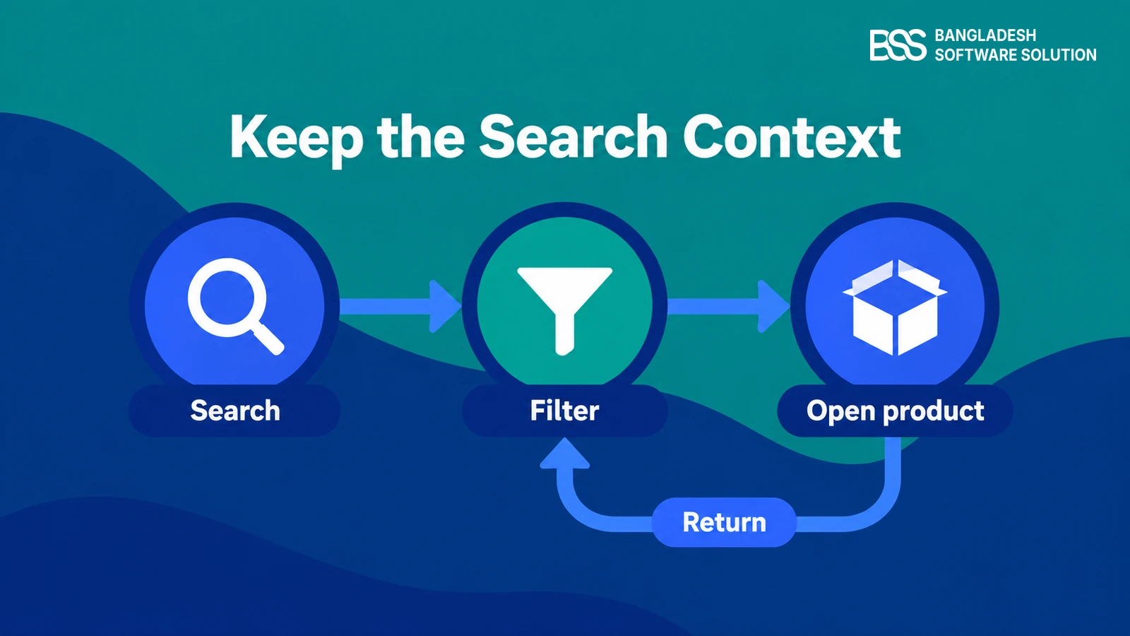
- Open a product, use the browser Back button and confirm the filters remain applied.
- Check that a no-results message offers a useful route back to the catalog.
Baymard’s filter guidance recommends visible applied filters and preserving filter state on Back navigation. On your store, also check the returning scroll position. The practical question is whether the buyer can continue comparing the shortlist they already created.
If filters require custom catalog or storefront work, BSS offers nopCommerce customization. Give the developer a reproducible search and navigation sequence rather than a general request to make browsing easier.
Need help implementing the fixes? BSS offers custom theme development and nopCommerce customization.
Discuss your store2. Specifications stop helping the buyer choose
Once the buyer opens a product, the next task is understanding exactly what is offered. Check whether the full model name, selected version and important specifications remain readable on a phone. A cropped title or an unexplained abbreviation can leave the listing difficult to evaluate.
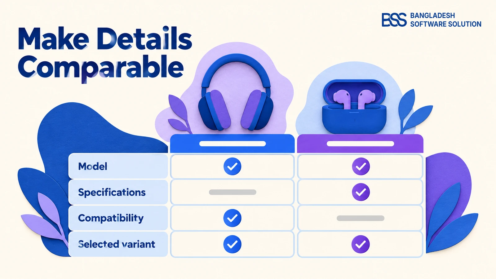
Baymard’s specification-sheet research recommends consistent attribute labels, ordering and units, plus explanations for technical terms. Apply that across similar products. If one listing says Memory and another says RAM, decide whether they mean the same attribute and use a consistent label where they do.
Put the information needed for the purchase decision near the relevant action. For accessories, that includes compatibility supported by the manufacturer’s documentation; for the item itself, distinguish included equipment from optional extras. If compatibility is unverified, say so rather than filling the gap with a reassuring sentence.
Make the selected item unambiguous
- Use the same labels and units for comparable specifications.
- Keep specification sections accessible and their headings descriptive.
- Check that changing a variant updates the displayed price and availability correctly.
- Confirm the cart names the selected variant rather than only the parent product.
Test the gallery as part of this decision, too. Can a shopper open a larger image, inspect a connector and return to the product without losing their selection? Use photographs of the actual item; do not treat a similar-looking connector as proof that products are compatible.
For mobile SEO, Google Search Central recommends equivalent primary content across desktop and mobile. Its guidance allows accordions and tabs to change the presentation. Use them to organize detailed specifications, while keeping the information available rather than deleting it to shorten the page.

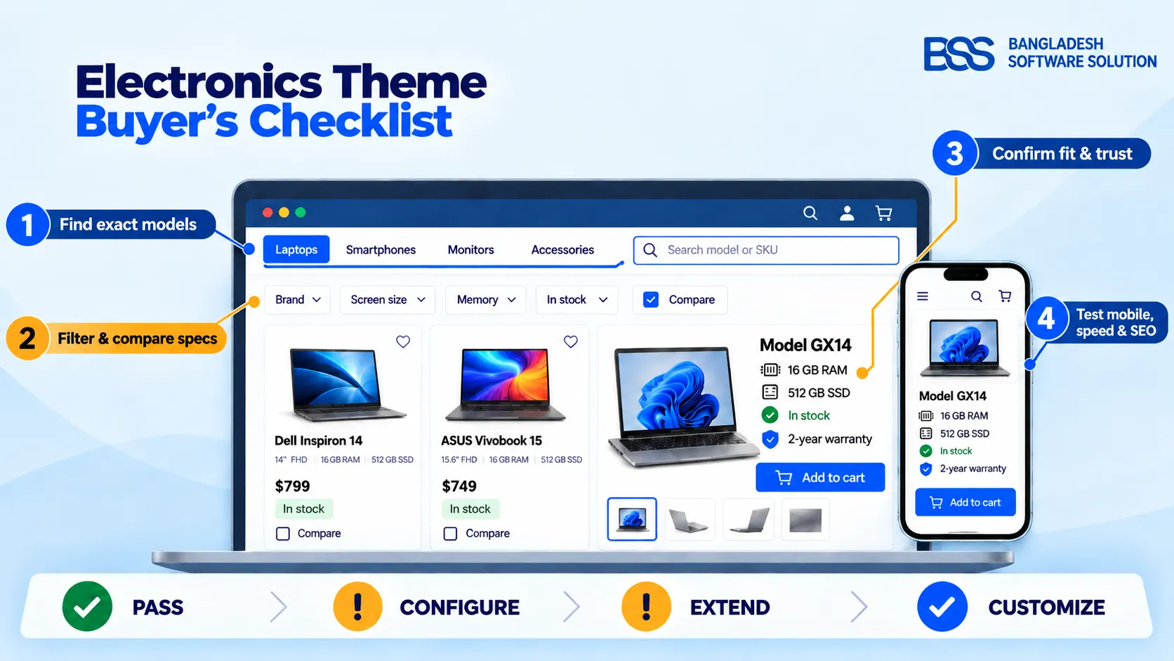
At BSS, we build nopCommerce themes and plugins. A clear product page also depends on the catalog information supplied to it; use our electronics theme buyer’s checklist to evaluate both the presentation and the buying tasks.
3. Touch controls and checkout interrupt the purchase
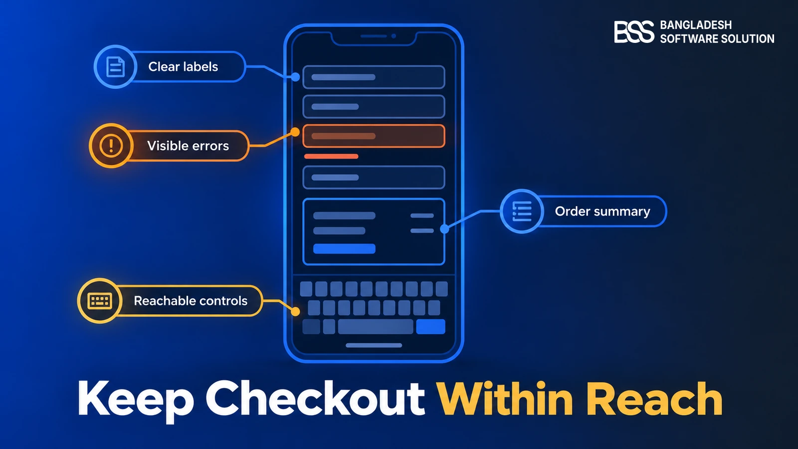
Now choose an option, add the item to the cart and enter an address. Test while the phone keyboard is open. Look for buttons covered by floating bars, fields hidden behind overlays and selections that are hard to tap without activating a neighbouring control.
W3C’s WCAG 2.2 Target Size (Minimum) criterion sets a 24-by-24 CSS-pixel target requirement, with spacing alternatives and specified exceptions. Treat that as an accessibility requirement to assess carefully. For primary shopping controls, give users ample space and test the actual clickable area, including icon-only buttons.
W3C’s Focus Not Obscured (Minimum) criterion also requires a focused component not to be entirely hidden by author-created content. Include keyboard navigation in the review. Check sticky purchase controls, cookie notices and chat widgets together, because the finished page is what the shopper interacts with.
Run checkout through the awkward states
- Check appropriate email and telephone keyboards and supported autofill.
- Submit an incomplete form and check whether errors identify the affected fields.
- Correct an error and confirm previously entered details remain available.
- Test payment success, cancellation and failure using the gateway’s test environment.
MDN documents inputmode as a hint for the virtual keyboard, and autocomplete as a way to identify expected information for browser autofill. Neither guarantees correct validation. Ask the developer to check field semantics, labels and error handling alongside the keyboard that appears.
Before payment, inspect the order summary on the phone: selected item, quantity, shipping choice and payable total. After a test payment, verify the store’s order state against the gateway response. Use the gateway’s documented test procedure; do not infer success solely from a redirect or confirmation message.
If that return path needs integration work, you can hire a .NET developer from BSS. Include the payment method, browser, exact test steps and observed order state in the handover.
4. The page loads, but the shopping actions lag
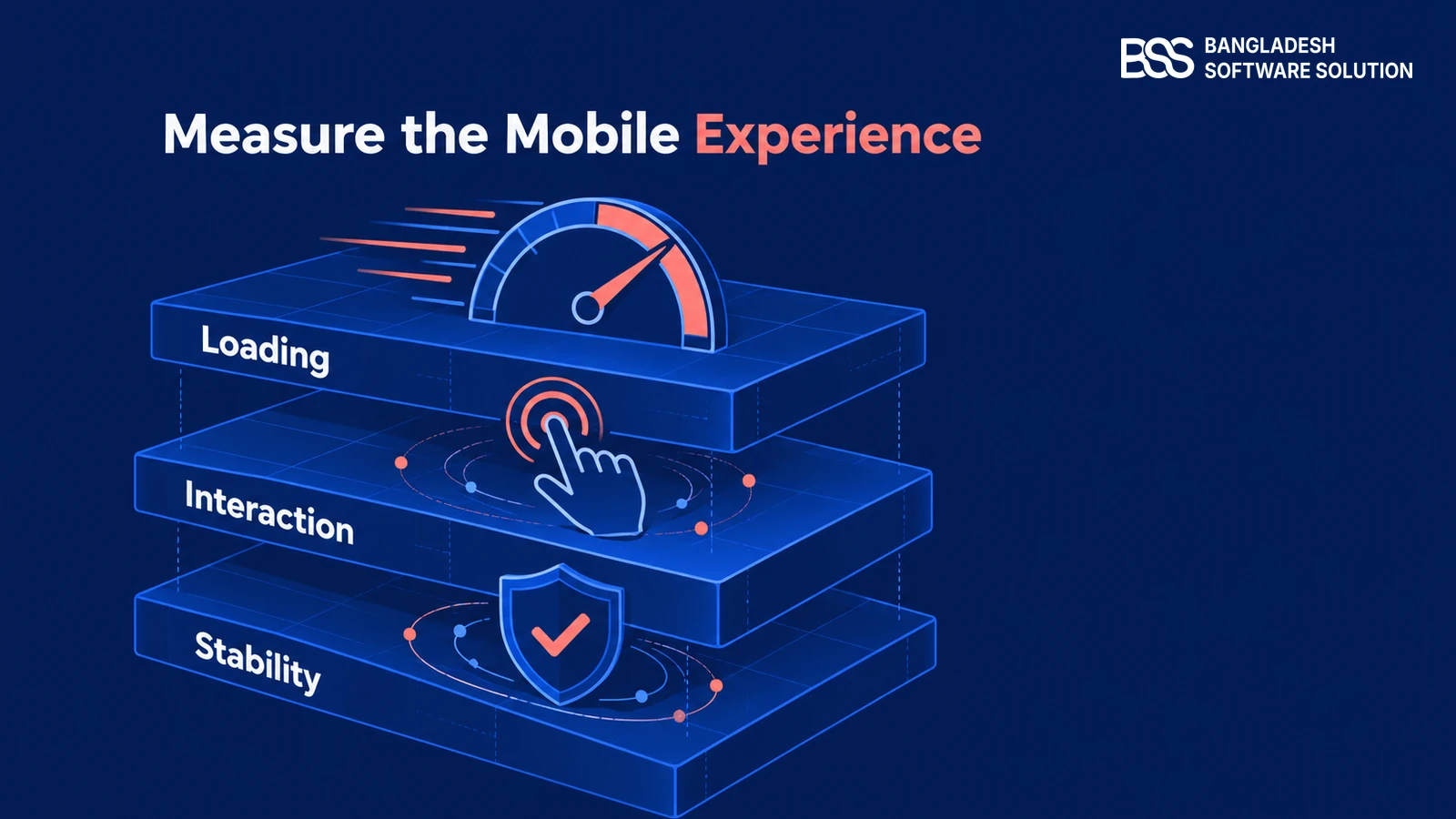
A page can appear on screen while filters, variant selectors or the cart still respond poorly. Measure those actions separately from the initial load. A responsive layout describes how content fits the screen; it does not establish how quickly the store responds.
Google’s web.dev guidance identifies three Core Web Vitals: Largest Contentful Paint for loading, Interaction to Next Paint for responsiveness and Cumulative Layout Shift for visual stability. These are distinct signals. A loading improvement alone does not establish that interactions or layout stability have improved.
Use a mobile lab test to investigate, then compare it with real-user data where available. web.dev cautions that lab measurement does not replace field measurement. A simulated load also cannot fully represent a shopper opening filters, entering an address and returning from payment.
Record the page, action and conditions for each fault. Then investigate the relevant layer: images, frontend scripts, network requests or server response. The nopCommerce performance optimization checklist provides a broader route through that diagnosis.
5. Repair the foundation, then repeat the same journey
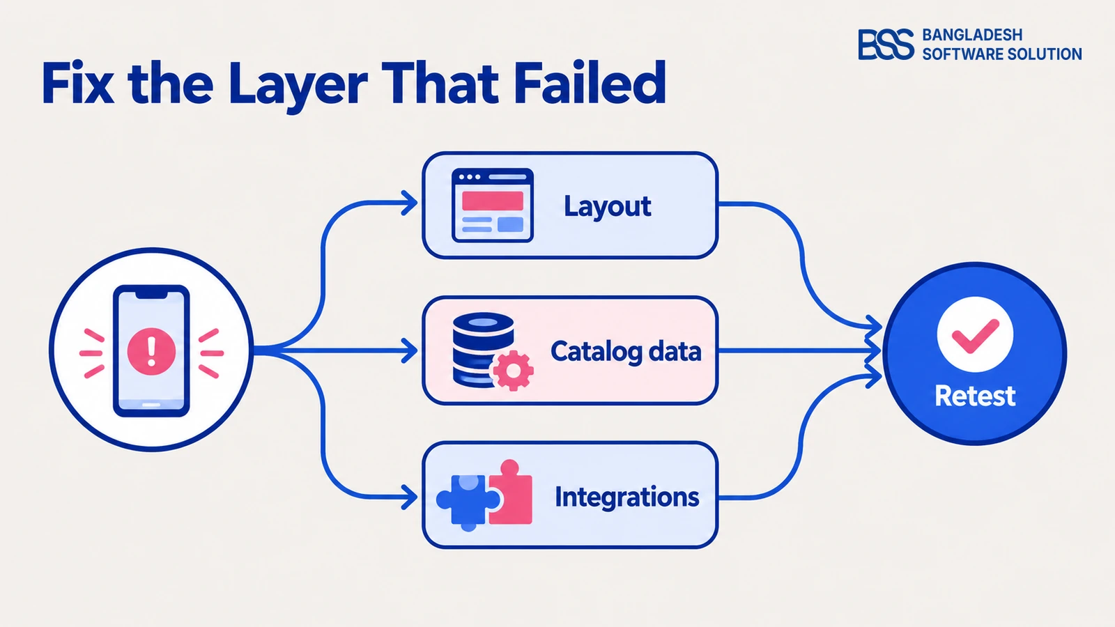
The tests should now give you a specific repair list. Separate layout problems from missing catalog information and integration faults. A clipped control belongs to a different task from an incorrect compatibility statement or a payment return that leaves an order in the wrong state.
For layout, check narrow screens and enlarged text as well as common phone sizes. W3C’s Reflow criterion addresses presentation at an equivalent width of 320 CSS pixels, with exceptions for content requiring a two-dimensional layout. A comparison table may need special handling; the surrounding page still needs to remain usable.
Write each finding as a task, an observed result and an expected result. For example: after returning from a product, the selected filter disappeared; it should remain applied. This is a suggested reporting format, not evidence of a fault in your store.
Include the device, browser and relevant product or variant in the report. Prioritize a task that prevents ordering ahead of a cosmetic adjustment, then verify the repair on the same journey. Baymard’s ecommerce audit guidance similarly treats mobile review as a purchase-flow check, covering navigation, product evaluation, cart clarity and checkout.
If the storefront needs a new responsive foundation, this is where nopGadget fits naturally. BSS describes it as a responsive nopCommerce theme designed for electronics and gadget stores. Its documentation includes configurable grids, spacing and container widths across phone-to-desktop screen sizes.
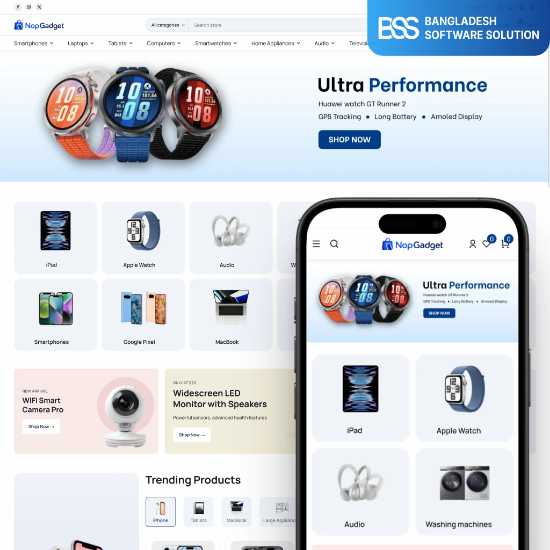
A responsive storefront foundation for electronics catalogs, with layout settings for phone, tablet and desktop screens.
Explore the themeEvaluate it using the same products and tasks that revealed the original issues. Check the chosen layout with long model names, real specifications, actual variants and enabled widgets. A theme’s responsive design is a starting point; your configured catalog and integrations determine the finished shopping journey.
At BSS, our ecommerce development work includes custom themes, integrations and performance optimization. For a layout-specific fault, the mobile layout troubleshooting guide helps turn the visible symptom into a focused repair task.
Make your electronics store easier to use on a phone
BSS offers nopCommerce theme development, customization, integrations and performance optimization. Bring the buying task that fails and discuss the work needed to fix it.
Frequently Asked Questions
Make the next purchase your acceptance test
Return to the exact model you chose at the beginning. Find it, verify the details, select the intended version and complete the test order on a phone. Mark each repair complete only when that task works, then keep the same journey for checks after catalog, theme or plugin changes.
Discuss responsive theme work, nopCommerce customization and integration changes with the BSS team. Start with the issues you can reproduce.
Book a free consultation