A shopper finds a jacket they like on your online clothing store website, but cannot tell whether their size is available or what the fit is like. The photographs look polished; the buying decision is still unfinished. That is the gap your website features need to close.
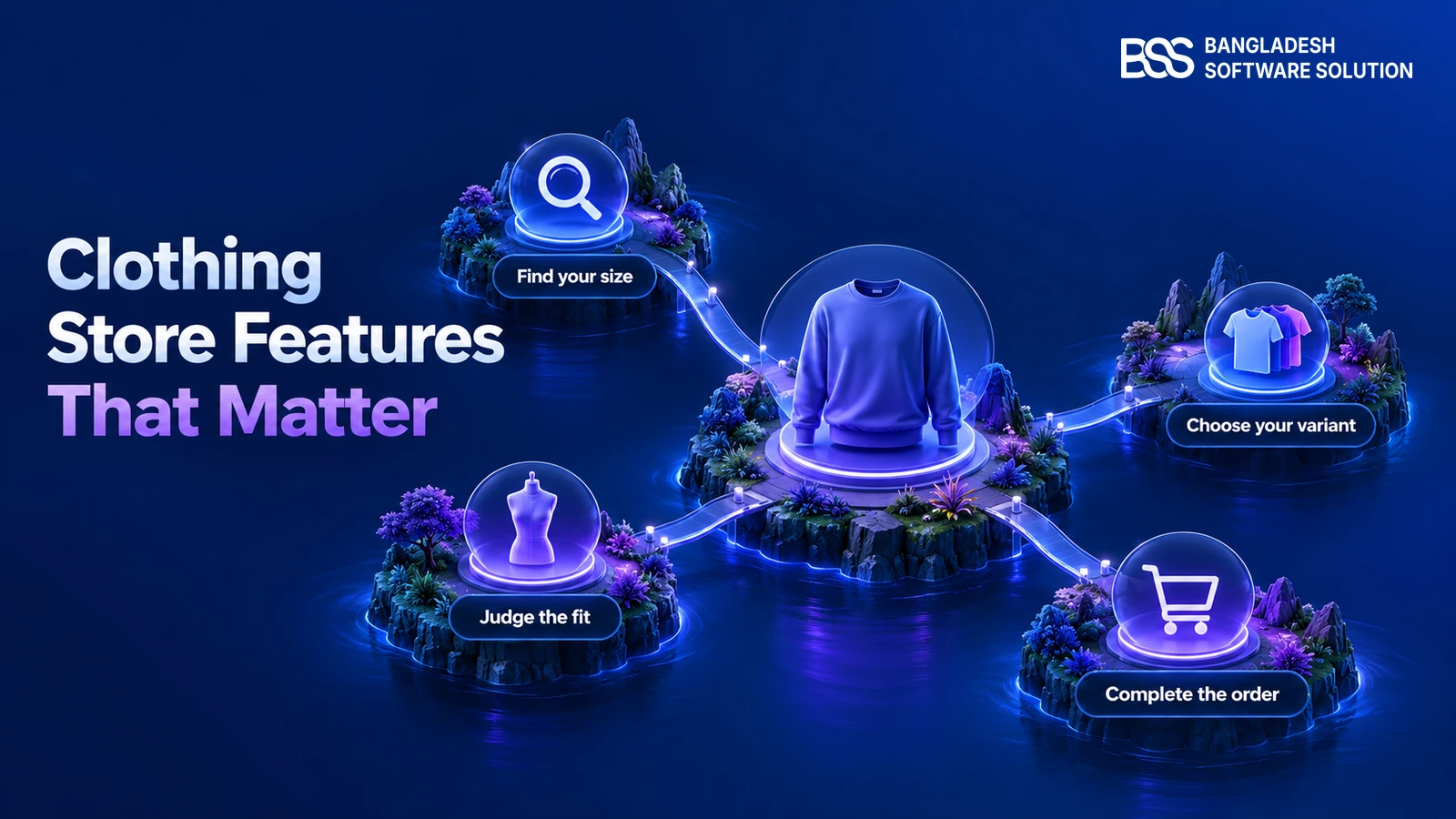
The essentials follow the purchase: help people find suitable clothes, understand the garment, select an available size and colour, and complete an order with clear delivery and returns information. This guide explains what each feature must actually do, with checks you can give to a designer or developer.
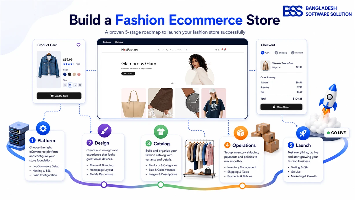
If you are still choosing a platform or planning launch operations, start with our fashion ecommerce store launch guide. Here, the focus is the shopping experience and how to judge whether a feature works.
Help shoppers find clothes they can actually buy
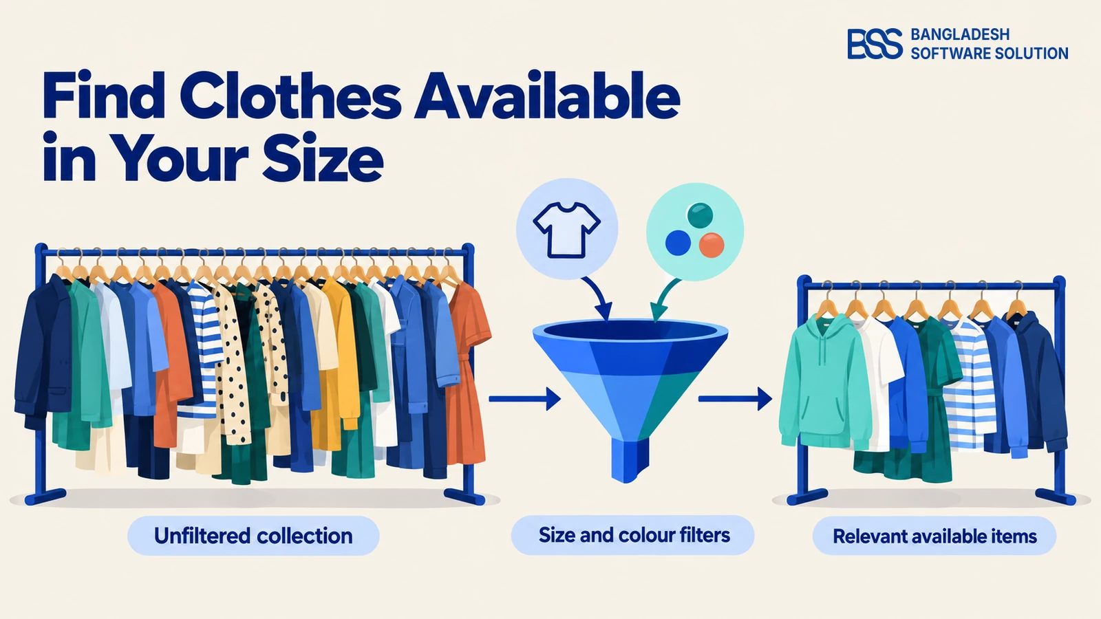
Consider someone looking for a dress in their size. A collection page that shows everything may look impressive, but the shopper still has to open individual products to discover which ones are suitable. Useful navigation and filters bring that information forward.
Baymard Institute’s apparel research recommends making size filtering easy to find. Its guidance on size-filter labels also shows why different sizing systems need clear grouping: an unexplained number or letter leaves shoppers interpreting the catalog themselves.
Navigation, search and filters need different jobs
- Navigation: use recognisable product categories, with collections or occasions as additional routes where they match your catalog.
- Search: test your actual product names and the alternative words customers use. Check what happens with misspellings and searches that return nothing.
- Filters: offer size, colour and price, then relevant attributes such as fit, material or brand. Show selected filters and make them easy to remove.
- Sorting: give useful choices, such as price and newest arrivals, with labels that accurately describe the order.
A size filter needs an acceptance check beyond “the button works.” Choose a size, open a result, and confirm that an available size-colour combination can be purchased. If filtering only checks a product’s descriptive tags, it may show styles whose matching variants are sold out.
On mobile, check that opening a product and returning to the collection preserves the shopper’s place and selections. Treat a helpful no-results message as part of search: it should let people remove filters or try another term without starting over.
Need help connecting the catalog and storefront? BSS offers nopCommerce setup and customisation for your store requirements.
Discuss the setupGive shoppers enough information to judge fit and fabric
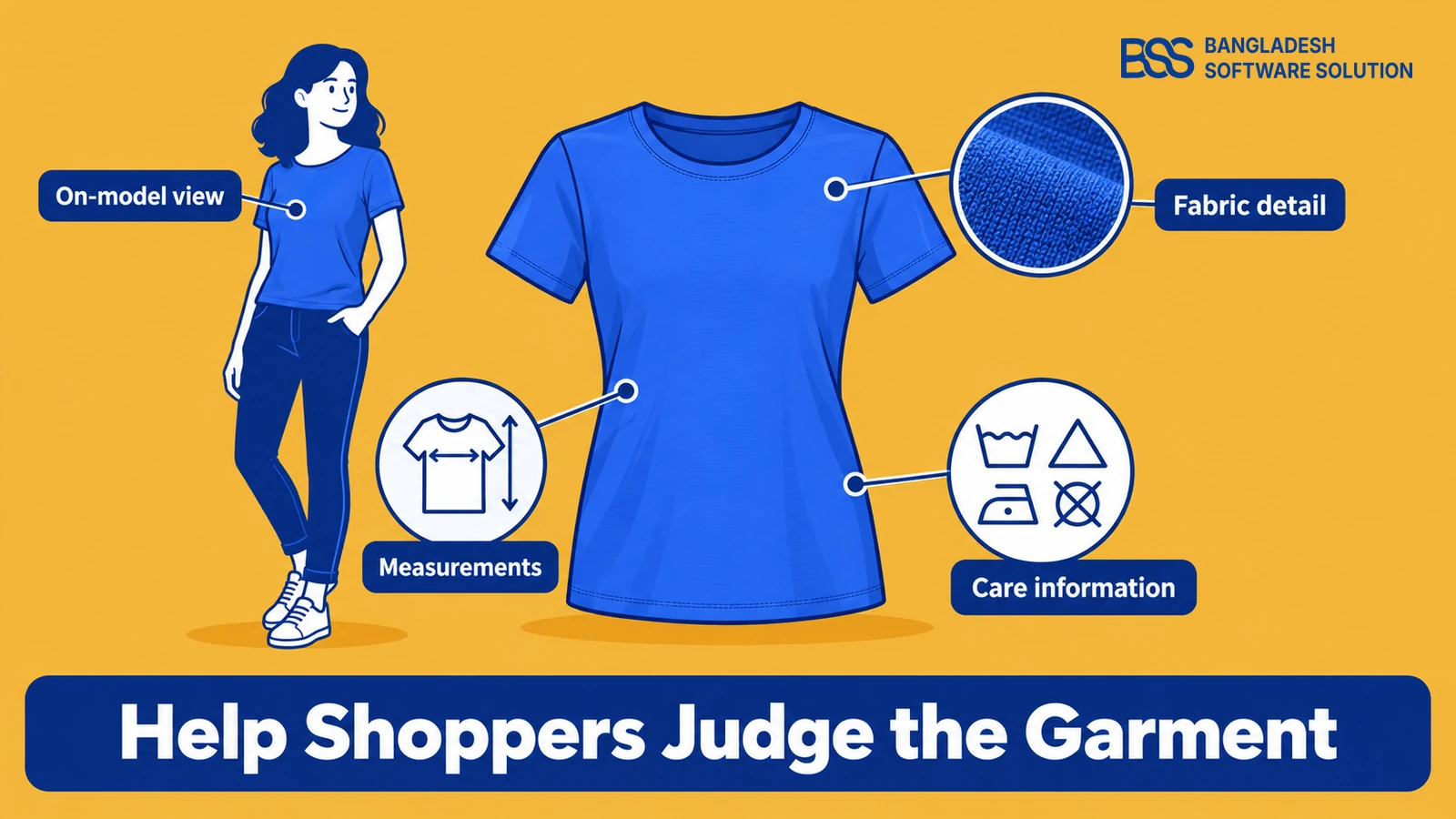
Once someone finds a promising item, the next question is whether it will suit them. A product page needs evidence about shape, material and sizing. Large photographs help only when they show the details the buyer is trying to evaluate.
Baymard’s research on human-model imagery explains that worn products need context to communicate length, proportion and fit. Its size-guide research separately distinguishes measurement information from a simple international size conversion.
Build the page around unanswered questions
- What does it look like worn? Show a clear on-model view and useful front, back and detail photographs. Avoid styling every image in a way that hides the garment’s length or shape.
- What am I buying? State the verified fabric composition, lining, fastening, pockets and care instructions where relevant.
- Which size should I select? Put a clearly labelled size guide beside the size selector. Include the measurements and measuring instructions appropriate to that product.
- Can I inspect the details? Provide usable zoom or enlargement, with images sharp enough to support it.
Label whether the chart describes body measurements or garment measurements, and state its units. Publish model measurements and the worn size only when your photography records confirm them. For a multi-brand catalog, use the appropriate brand or product chart rather than treating every “medium” as equivalent.
Presenting those photographs well also needs the right storefront tools. For a nopCommerce clothing store, our NopVogue theme includes Product Picture Gallery with zoom and fullscreen viewing, plus QuickView for inspecting product details while browsing. These support the visual side of the decision; your own photographs and size information still need to explain the garment accurately.
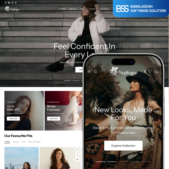
A fashion storefront foundation with product viewing, visual customisation and checkout tools to evaluate against your buying journey.
Explore the themeReviews can add another source of information about fit, but they should remain identifiable customer feedback. Invite useful details about sizing and the garment; do not turn a review tool into a reason to create testimonials or unsupported “runs small” claims.

We build nopCommerce themes and plugins at BSS; the content a theme displays still needs an owner. Assign size charts, product photography and care information to named tasks in your catalog process, and see our theme customisation guide for the presentation work.
Keep size, colour, stock and the cart in agreement
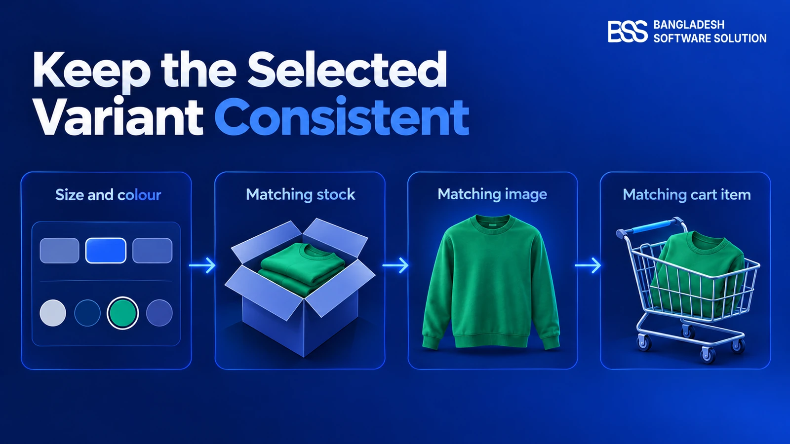
A shopper selects their size, then changes the colour. If that combination is unavailable, the page needs to explain it before purchase. The selected photograph, availability message and item added to the cart should all describe the same variant.
Baymard’s apparel study identifies coherent size-and-colour selection as a separate usability requirement. Use visible selection states, meaningful colour names and clear unavailable options; do not rely on a coloured square alone to explain the choice.
Separate a product description from sellable stock
In nopCommerce, the official documentation distinguishes specification attributes used for information and category filtering from product attributes used for purchasing choices. Specification attributes do not track inventory. Product attribute combinations can have their stock tracked when “Track inventory by product attributes” is configured.
That distinction matters when scoping a clothing store. Listing “blue” and “large” in filters is different from maintaining the stock record for the blue, large garment. Ask the implementer to demonstrate how those two parts stay consistent.
- Change size and colour in both directions and check availability.
- Confirm the gallery and cart identify the selected colour.
- Check that the order records the chosen size and colour correctly.
- Test sold-out combinations, quantity changes and your intended backorder rules.
These checks should use real catalog records and deliberately prepared test stock. Do not accept a demo in which every combination happens to be available. If stock comes from another system, test the update path as well as the storefront selection.
BSS’s published OLA Sportswear case study describes a nopCommerce store with ERP inventory synchronisation. That is a concrete example of stock being an integration requirement, not just a visual badge; see the sportswear implementation when planning your own stock connection.
Make the total, delivery and aftercare clear
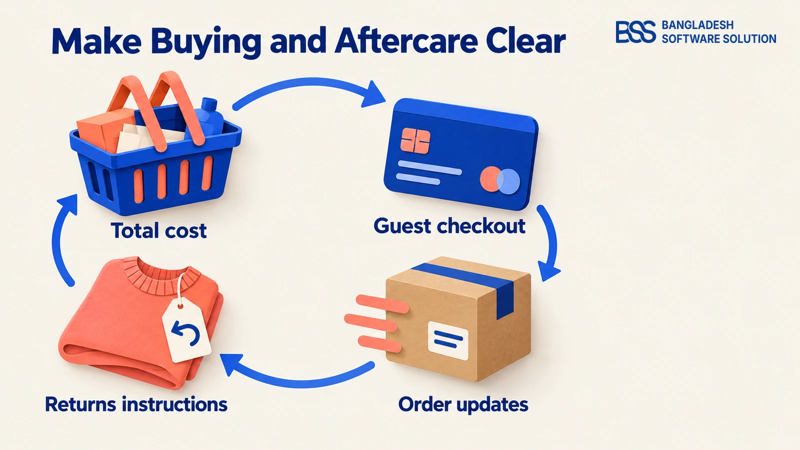
Before paying, the shopper needs to know what the order will cost and what happens next. Keep the selected garment details in the cart, provide clear quantity editing, and explain shipping charges and the delivery options that actually apply to the order.
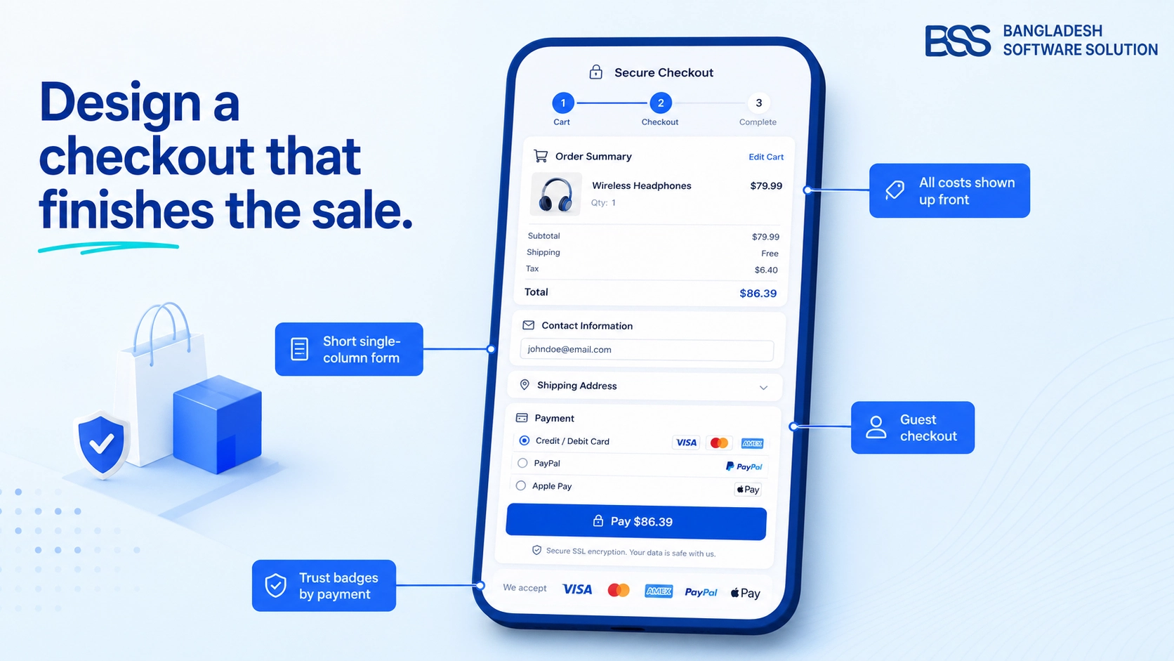
Baymard’s checkout research recommends a prominent guest checkout option, transparent costs and manageable forms. A single page is not the acceptance criterion: people should be able to understand the process, correct errors and finish payment without losing their information.
Buying confidence continues after the payment
- Before purchase: show the total and applicable charges, available payment methods, delivery information and an accessible returns summary.
- During checkout: label fields, explain validation errors and make the guest route clear. Test the payment methods you actually offer.
- After purchase: provide an order confirmation, understandable status updates and a route to support or tracking where available.
- For returns: explain how to start a request, the applicable conditions, who pays return shipping and how refunds or exchanges are handled.
Write delivery and returns copy from your fulfilment process and approved policies. Do not publish a delivery promise, free-return badge or exchange option that your team cannot honour. Product-specific restrictions should be easy to find before a buyer commits.
Acceptance testing should include a successful payment, a failed payment and an interrupted attempt, followed by confirmation checks. For a fuller review of the purchase form, continue with our checkout design guide.
If the payment or shipping workflow needs custom work, hire a .NET developer from BSS for those integrations. Define the required order outcomes before choosing the checkout layout.
Choose a storefront that supports the essentials
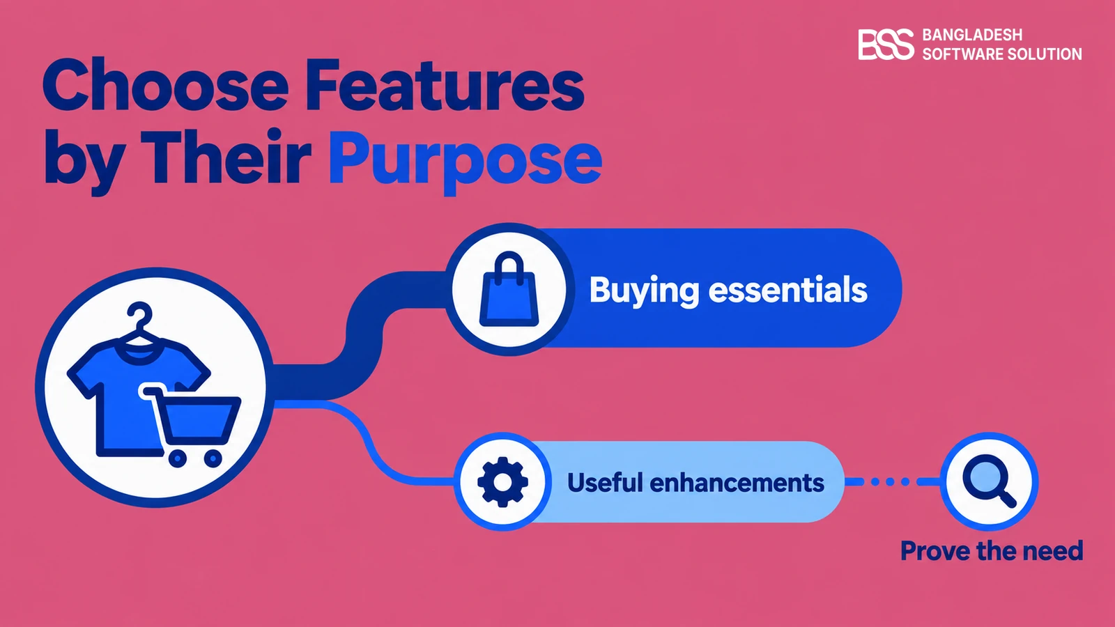
With the buying journey defined, you can judge themes and plugins against your requirements. Test the collection, product page and checkout on a phone as one continuous task. Include keyboard navigation, labelled controls and visible focus when reviewing accessibility.
Image performance deserves its own check in a fashion catalog. Google’s web.dev guidance recommends responsive image sizes and reserving image space to avoid layout shifts. Assess the pages with your photographs and enabled tools, rather than treating a theme’s performance claim as a measurement of your store.
| Priority | Feature purpose | Decision test |
|---|---|---|
| Buying essentials | Discovery, fit information, accurate variants, payment and aftercare | Can someone choose an available garment and complete the order? |
| Useful enhancements | Wishlist, QuickView, outfit suggestions and back-in-stock alerts | Does it solve a documented shopping or support need? |
| Specialised tools | Interactive fit recommendations, virtual try-on and loyalty programmes | Is there evidence to justify implementation and upkeep? |
For search visibility, give products descriptive content and make price and availability accurate. Google Search Central documents product and product-variant structured data, which can make eligible pages suitable for richer search appearances. Eligibility does not guarantee a particular display or ranking.
Turn your requirements into a working clothing store
BSS offers nopCommerce setup, customisation and integrations. Bring your catalog and the buying journeys you need to support.
Frequently asked questions
Give each feature a job, then test it
Return to the shopper considering that jacket. A useful clothing website lets them find an available option, judge the garment and fit, select the correct variant, and pay with clear expectations. Each feature should help complete one of those tasks.
Write your requirements as demonstrations: show the matching stock, open the size guide, change the colour, complete checkout and find the return instructions. Fix the gaps those tests expose, then decide which additional tools your store needs.
Discuss the product data, theme configuration and integrations your clothing store needs.
Book a free consultation