BSS Picture Gallery
Created on: May 11, 2026
PRE-REQUISITES
-
The plugin requires you to install the BSS Core plugin first.
INSTALLATION
-
Download the BSS Picture Gallery plugin from our store https://store.bssoln.com/
-
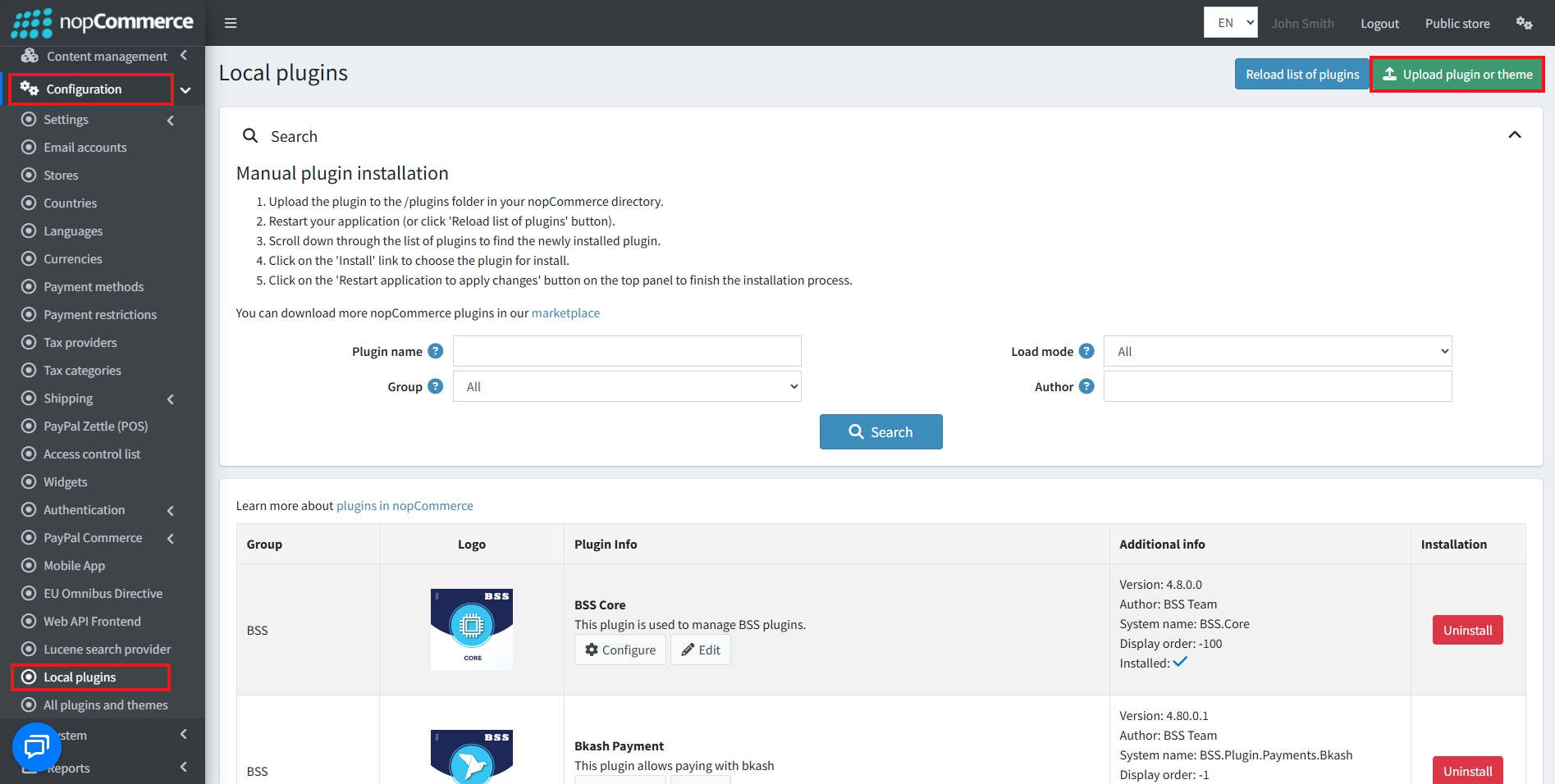
Go to Administration → Configuration → Local plugins
-
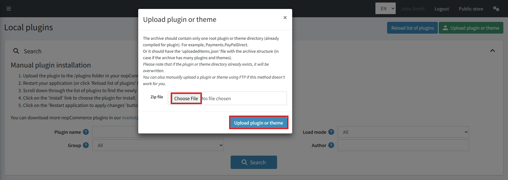
Upload the BSS.PictureGallery zip file using the ‘Upload plugin or theme’ button
-
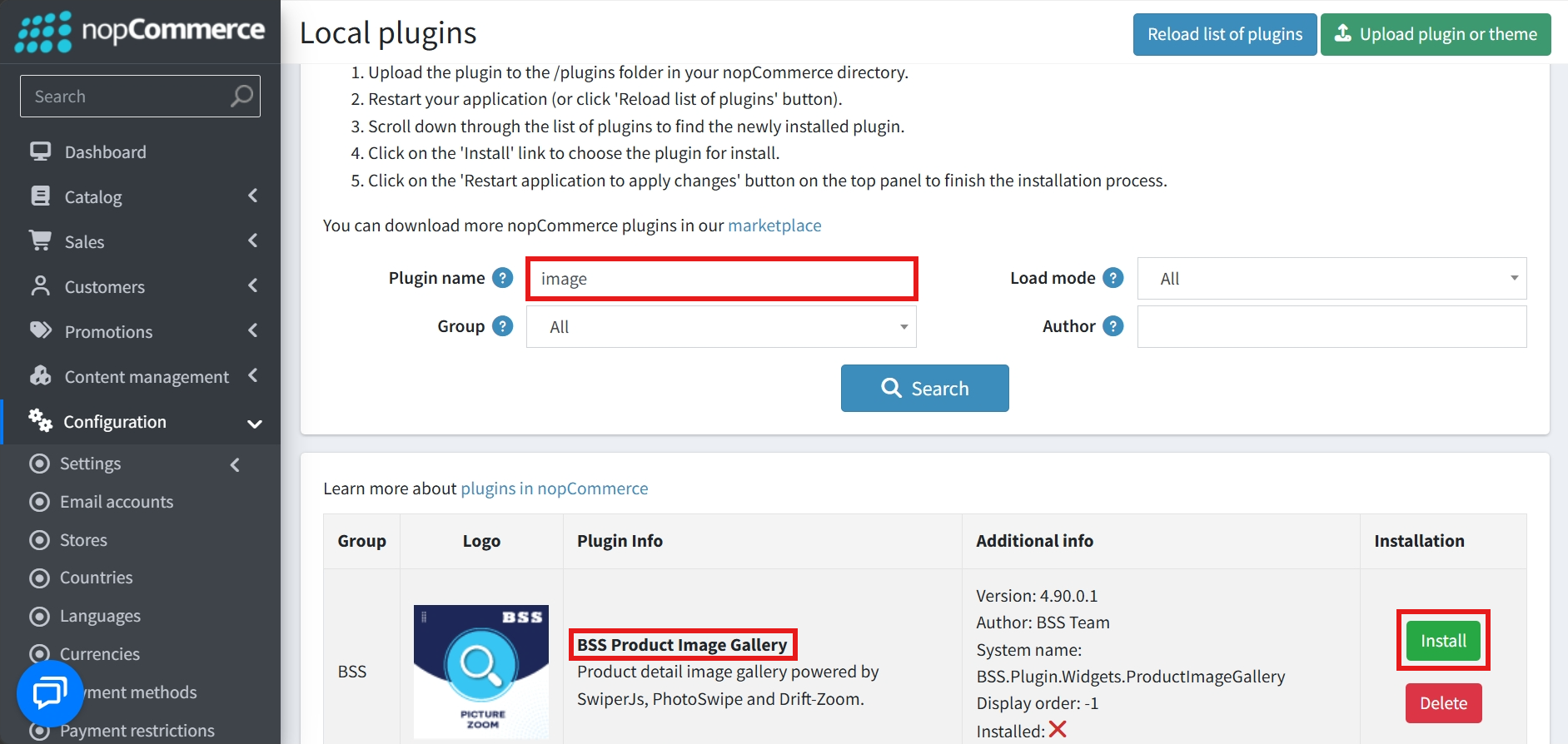
After uploading, install the ‘BSS Core’ Plugin first.
-
Then scroll down or write the name of the plugin in the search bar to find and install ‘BSS Picture Gallery’
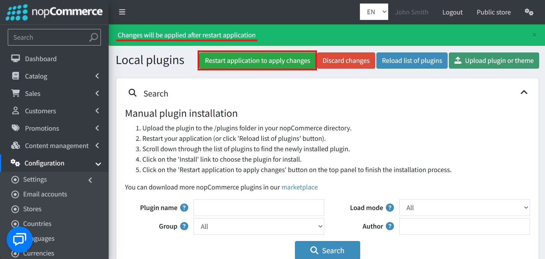
- To make the plugins functional, restart the application
- After installation, the plugin will show in the menu.
CONFIGURE
-
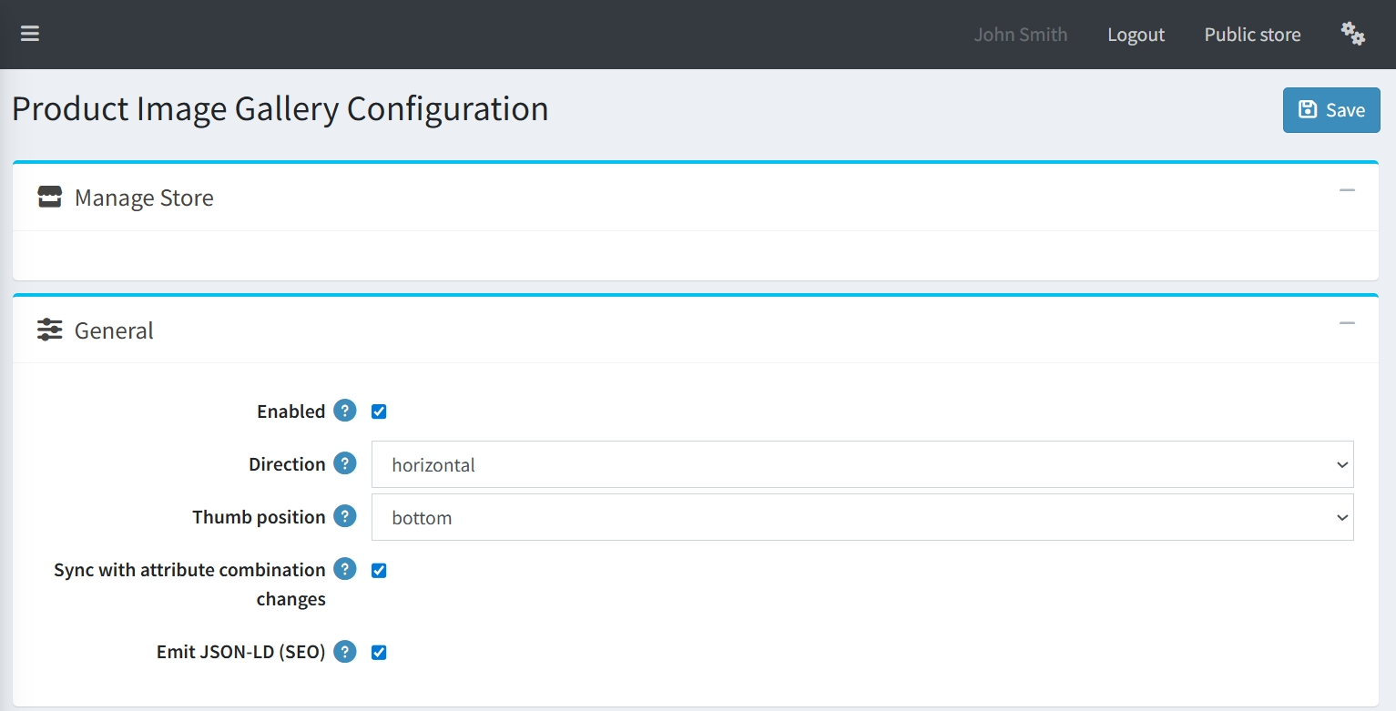
Go to Admin → BSS → Plugins → Product Image Gallery → Configuration
.png)
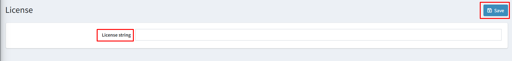
-
Enter the License string and save it. Then clear cache.
-
Then again go to BSS → Plugins → Product Image Gallery → Configuration to set the configuration.
GENERAL SETTINGS
-
Enabled: A simple checkbox used to globally activate or deactivate the gallery plugin.
-
Direction: A dropdown menu to define the primary orientation of the gallery, such as "horizontal".
-
Thumb position: Allows you to specify where the thumbnails are located relative to the main image.
-
Sync with attribute combination changes: When enabled, the gallery will automatically update the displayed images as customers select different product attributes, ensuring they always see the correct variant.
-
Emit JSON-LD (SEO): An essential feature for search engine optimization that generates structured data (JSON-LD) for your product images, helping them rank better in search results.
MAIN IMAGE
-
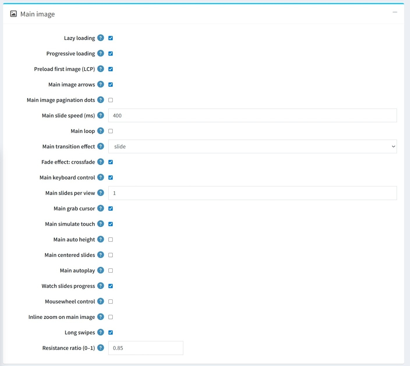
Performance Optimization: Includes options for Lazy loading, Progressive loading, and Preloading the first image (LCP) to optimize page speed.
-
Navigation Controls: Toggle Main image arrows and pagination dots, and enable interaction via keyboard control, mousewheel control, and a grab cursor.
-
Animation & Transitions: Customize the Main slide speed (ms) and the Main transition effect with an additional option for a crossfade effect. You can also enable a Main loop for continuous scrolling.
-
User Interaction: Features like Main simulate touch, Long swipes, and the Resistance ratio (adjustable between 0–1) enhance the tactile feel on mobile and desktop.
-
Layout & Display: You can set the number of Main slides per view, enable Main auto height, or use Main centered slides to customize the gallery's physical appearance.
-
Special Features: There are dedicated toggles for Main autoplay, Watch slides progress, and the ability to enable Inline zoom on the main image.
THUMBNAIL GALLERY
-
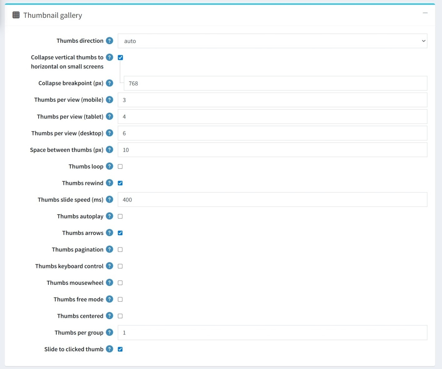
Appearance: Control the physical layout by setting the Thumbs direction and defining the exact Space between thumbs (px), and whether they should loop or rewind.
-
Responsive Behavior: Set Thumbs per view specifically for mobile, tablet, and desktop. Enable Collapse vertical thumbs to horizontal for small screens with a customizable breakpoint.
-
Slide Speed & Autoplay: Set the exact Thumbs slide speed (ms) for animations and enable Thumbs autoplay for a hands-free experience. Determine how many thumbnails move at once by setting Thumbs per Group.
-
Navigation: Toggle Thumbs arrows, Thumbs pagination, and the ability to Slide to clicked thumb.
-
Multi-input Support: Enable keyboard control and mousewheel interaction specifically for the thumbnail strip.
-
Free Mode & Centered: Thumbs free mode allows for fluid, non-snapping scrolling, while Thumbs centered ensures the active thumbnail always stays centered.
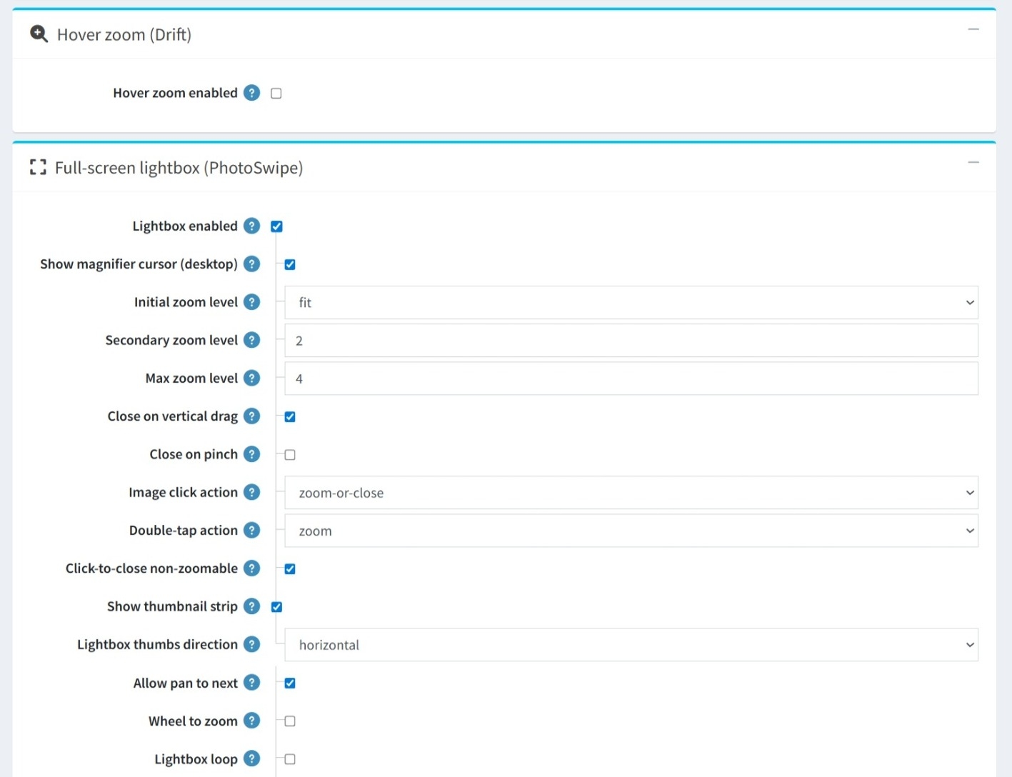
HOVER ZOOM & FULL-SCREEN LIGHTBOX
-
Hover zoom (Drift): A dedicated toggle to enable or disable zoom functionality when hovering over the main image.
-
Lightbox Activation: Use the Lightbox enabled checkbox to turn the full-screen viewing mode on or off.
-
Magnifier Cursor: You can enable a magnifier cursor (desktop) to provide a visual cue to users that the image can be expanded.
-
Zoom Controls: Set Initial, Secondary, and Max zoom levels, and define actions for image clicks or double-taps.
-
Gesture-Based Closing: Toggle the ability for users to exit the lightbox using a vertical drag or a pinch gesture.
-
Click-to-close non-zoomable: A helpful utility that automatically closes the lightbox if a user clicks on a non-zoomable image.
-
Thumbnail Strip: Enable a thumbnail strip within the lightbox for quick navigation between items and choose its direction.
-
Panning & Zooming: Control how users move through the gallery with Allow pan to next and the option to enable Wheel to zoom for desktop users.
-
Lightbox Loop: When enabled, users can cycle through the images infinitely without stopping at the last one.
-
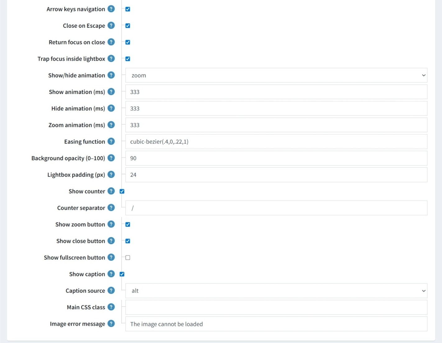
Keyboard Controls: Includes toggles for Arrow keys navigation and Close on Escape to allow users to navigate or exit the lightbox without a mouse.
-
Focus Management: Features like Return focus on close and Trap focus inside lightbox ensure a seamless experience for users relying on assistive technologies.
-
Transition Styles: You can choose the specific Show/hide animation and define the Easing function for all movements.
-
Timing Control: Provides granular control over animation durations, allowing you to set the exact milliseconds for Show animation, Hide animation, and Zoom animation.
-
Styling & Feedback: Fine-tune the lightbox appearance with Background opacity, Lightbox padding, and and customize the Image error message for instances where a file cannot be loaded.
-
Display Overlays: Options to Show counter, with a customizable Counter separator, and Show caption, which can be pulled from a Caption source like the image's alt text.
-
Action Buttons: Toggle the visibility of the Zoom button, Close button, and Fullscreen button.
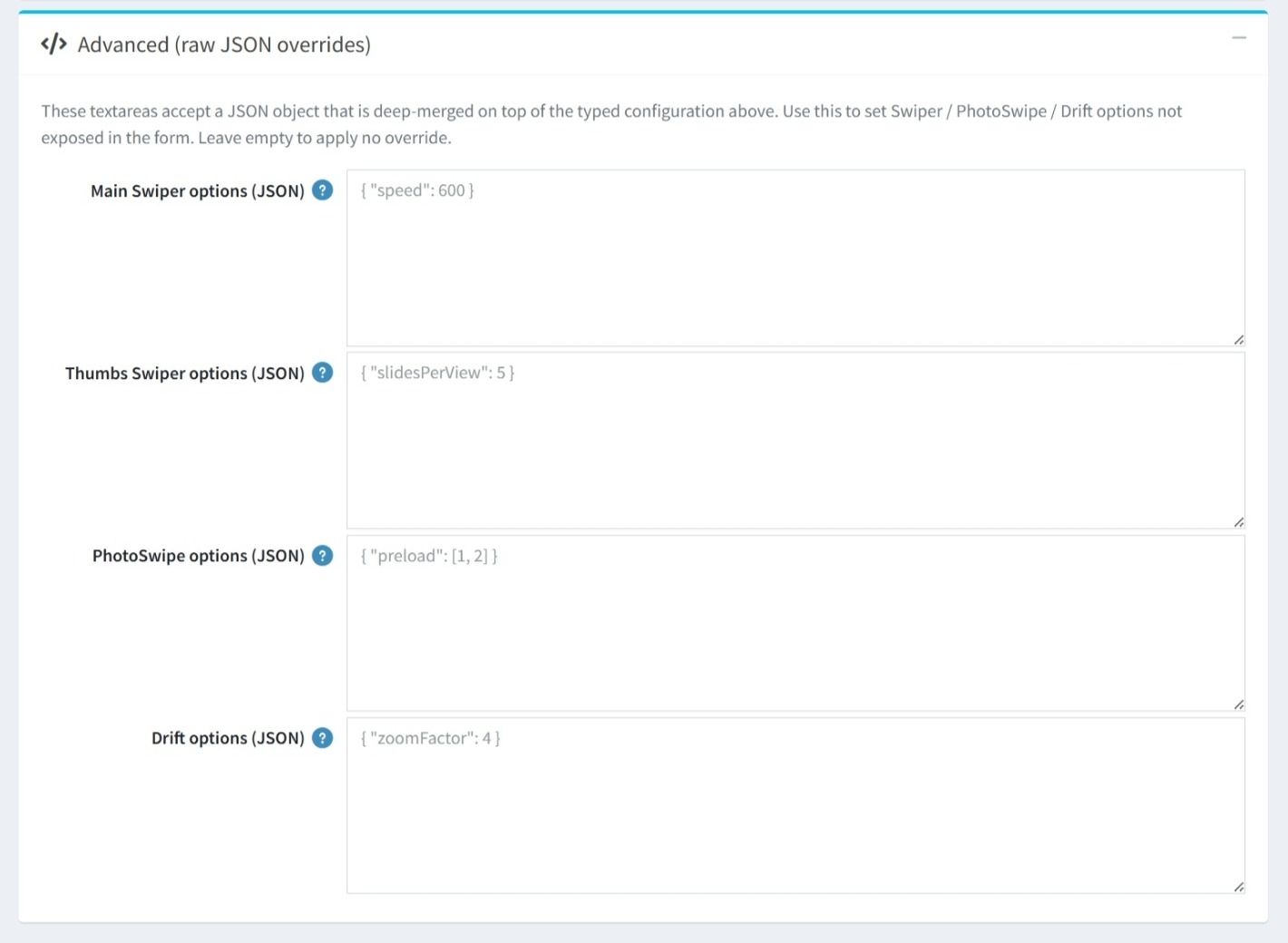
ADVANCED
-
The Advanced (raw JSON overrides) section is designed for power users and developers who require deeper customization beyond the settings available in the standard administration form.
-
Targeted Overrides: You can apply custom JSON code to four specific areas of the plugin's core libraries:
-
Main Swiper options (JSON)
-
Thumbs Swiper options (JSON)
-
PhotoSwipe options (JSON)
-
Drift options (JSON)
-
-
If these fields are left empty, the plugin will simply use the default settings configured in the earlier sections.
PUBLIC VIEW
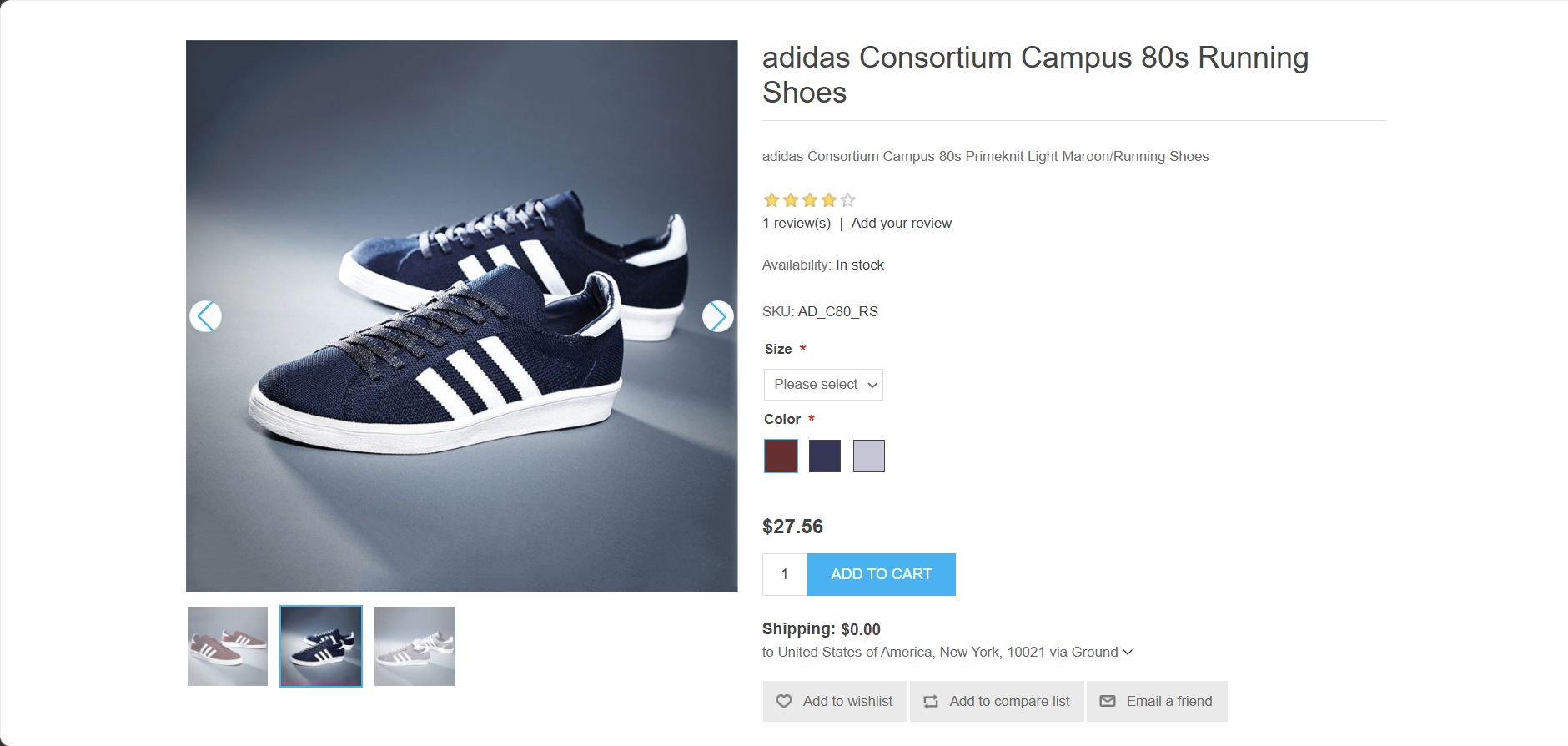
FEATURES
-
Attribute Syncing: Automatically updates the displayed image when customers select different product variants.
-
SEO Optimization: Emits JSON-LD structured data to improve product image visibility in search results.
-
Performance Built-in: Includes lazy loading, progressive rendering, and LCP preloading to ensure fast page speeds.
-
Flexible Layouts: Customizable gallery orientation and thumbnail positioning.
-
Device-Specific Views: Set different thumbnail counts for mobile, tablet, and desktop.
-
Adaptive Design: Automatically collapses vertical thumbnails to horizontal on smaller screens based on a custom breakpoint.
-
Fluid Navigation: Supports touch gestures, keyboard arrows, mousewheel scrolling, and grab-to-swipe interactions.
-
Interactive Strips: Features slide to clicked thumb, infinite looping, and optional navigation arrows.
-
Visual Customization: Adjustable slide speeds and transition effects, including a smooth crossfade option.
-
Inline Zoom: Allows customers to view fine details directly within the main product image container.
-
Hover Zoom (Drift): Provides a professional magnifier effect when hovering over product images.
-
Full-Screen Lightbox: A sophisticated PhotoSwipe integration with multi-level zoom, image counters, and captions.
-
Touch & Gesture Support: Intuitive mobile controls including pinch-to-zoom, double-tap actions, and vertical drag-to-close.
-
JSON Overrides: Developers can inject raw JSON objects to deep-merge custom settings for the underlying slider and zoom libraries.
