VulcanEdge Theme + 19 Plugin Bundle for NopCommerce
Created on: Nov 19, 2026
PRE-REQUISITES
- The theme requires installation of the BSS Core plugin first.
INSTALLATION
- Go to the Order Details Page and Download VulcanEdge theme
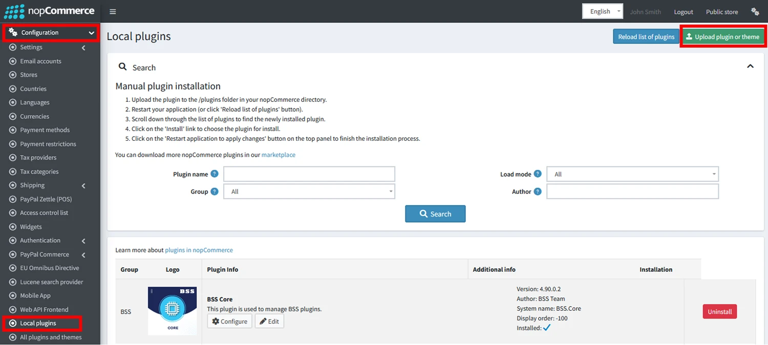
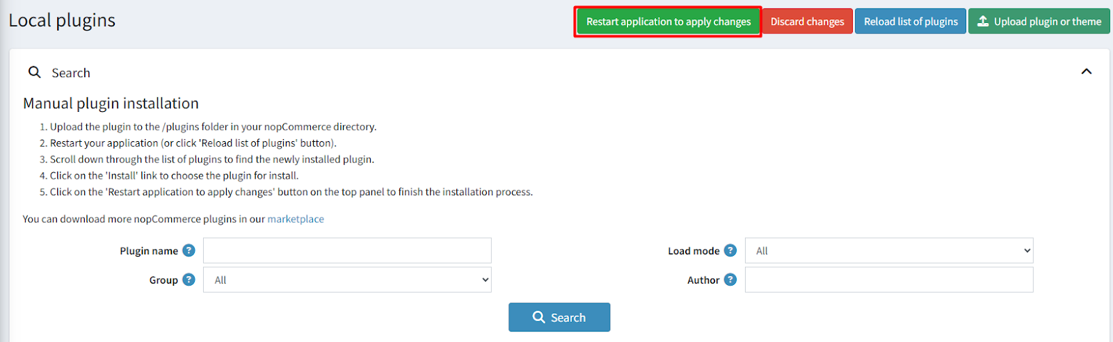
- Go to Administration → Configuration → Local plugins
- Within the bundle, you get all the required files, including BSS.Core
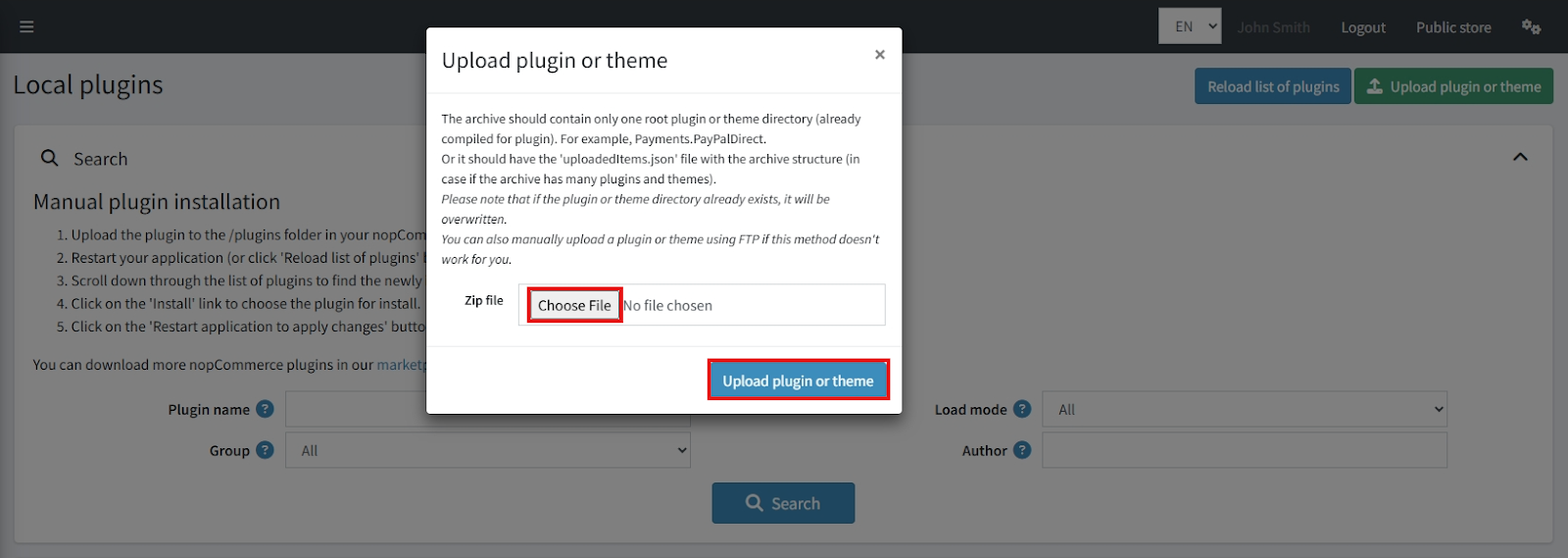
- Upload the zip files using the 'Upload plugin or theme' button
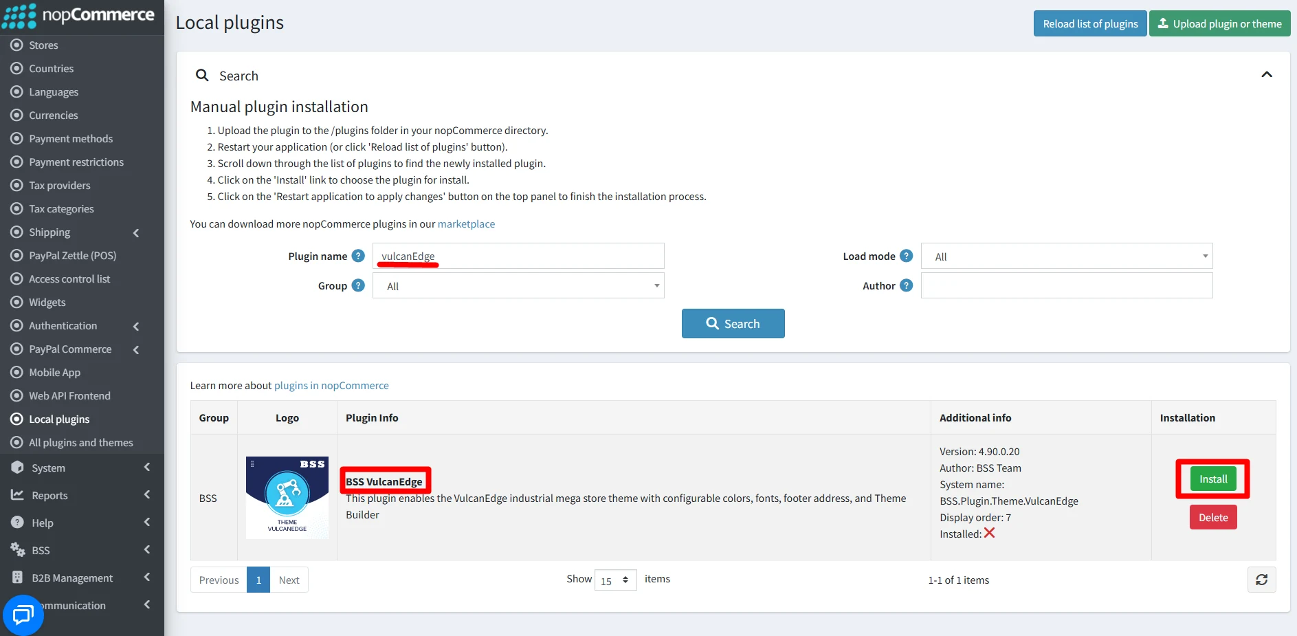
- After uploading, install the ‘BSS Core’ Plugin and ‘VulcanEdge Theme’.
- To make the theme functional, restart the application.
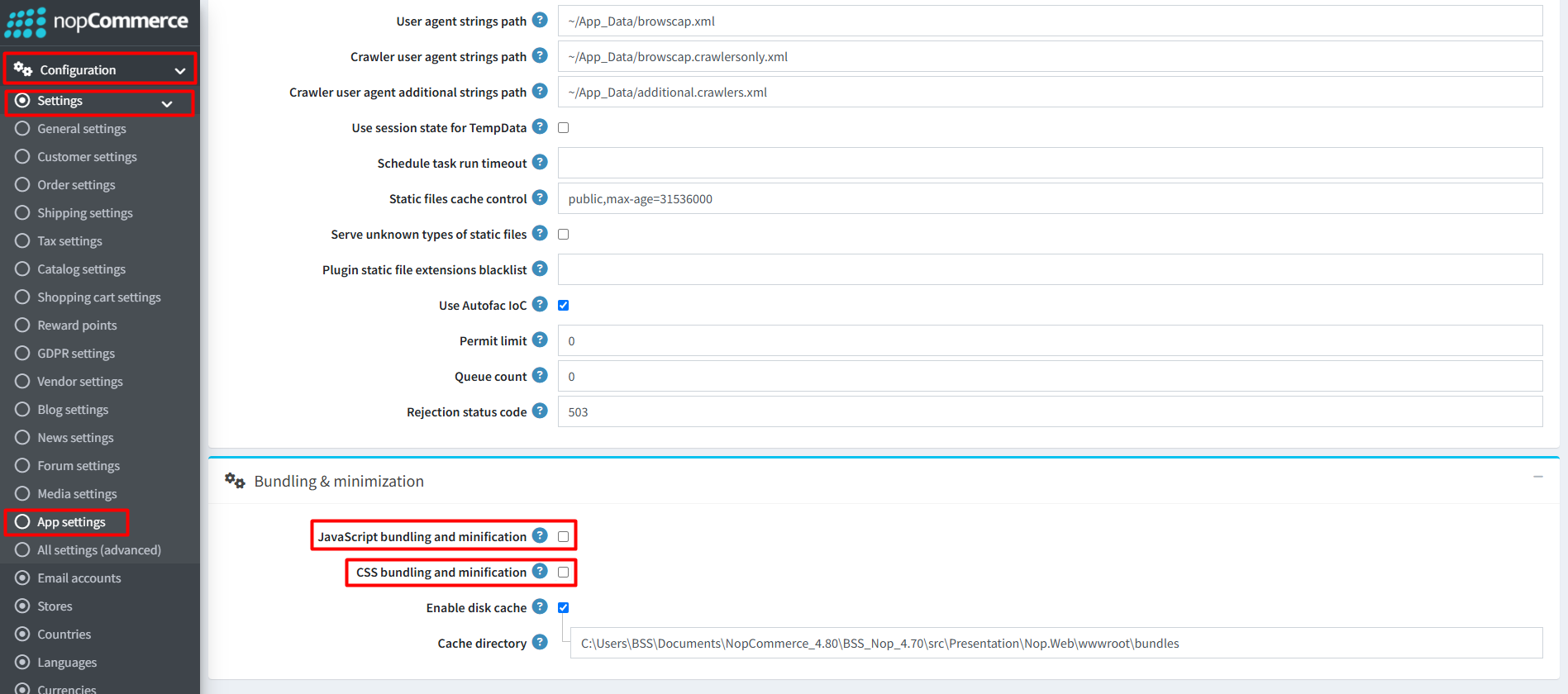
Recommendation: Go to > App Settings. If you find JavaScript bundling and minification, CSS bundling and minification are checked, then uncheck these two options and disable them.
ENABLE THE THEME
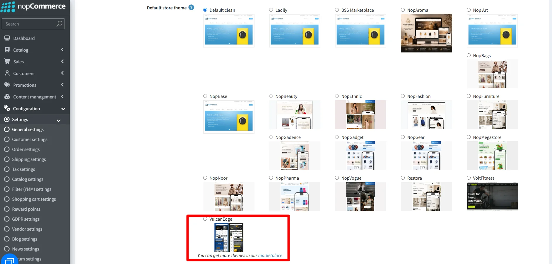
- Go to Configuration → Settings → General settings in the admin panel.
- Choose VulcanEdge as the Default store theme and save it.
ENABLE OTHER ASSOCIATED PLUGINS
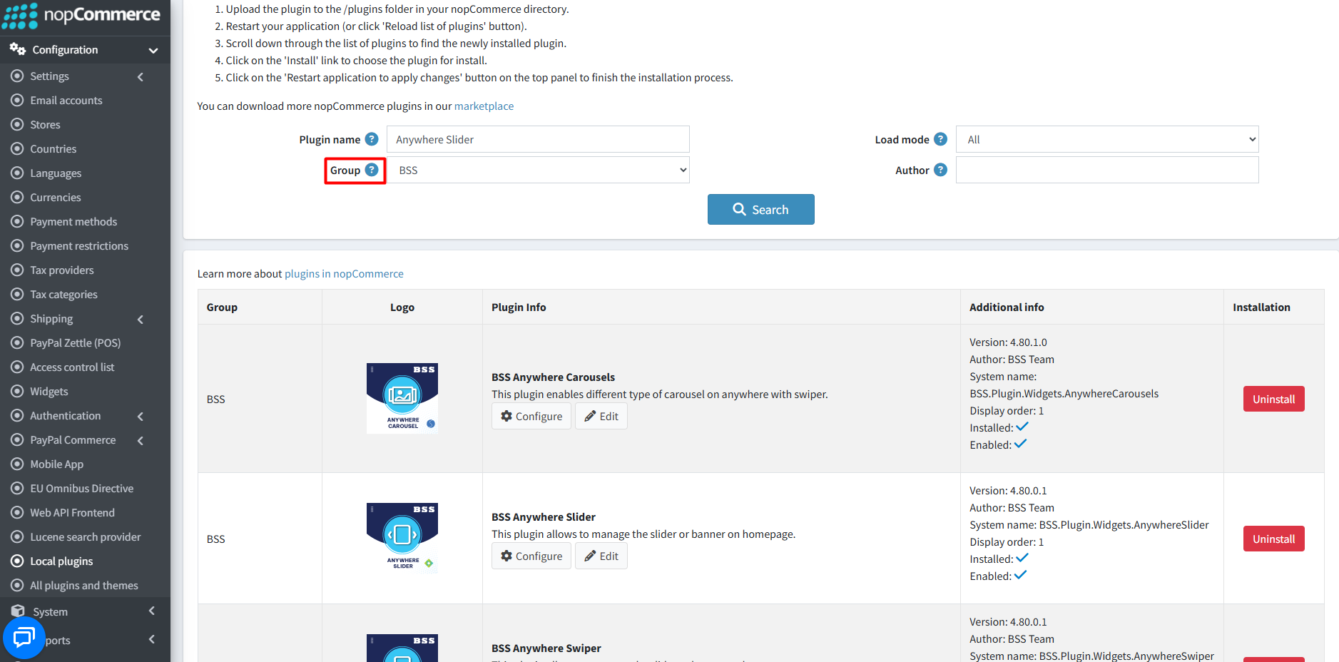
- Go to Administration → Configuration → Local plugins.
- Search the plugins associated with VulcanEdge theme using the Group Name ‘BSS’.
- To get the expected homepage view, install plugins by using the Group Name or Plugin Name.
LICENSE KEY
- After purchasing, contact BSS to receive the license key via email.
- First-time configuration of the theme or bundled plugins prompts entry of the License string. It can also be entered via BSS → Core settings → License.
- After entering the License string, save it and clear the cache.

CONFIGURATION
- Go to Administration → BSS → Themes → VulcanEdge → Configuration to set the theme configuration.
COLOR SETTINGS
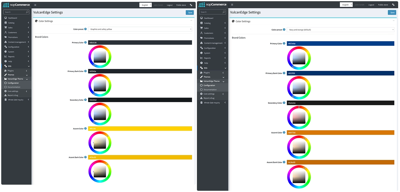
Use these settings to define your storefront's color palette. For any individual color field, enter a specific hex code, such as #023e8a, or select a shade using the interactive color wheel.
Color Preset
- Color preset: Select a pre-built, tested color scheme, such as Navy and orange, to populate your brand, background and border colors in one step.
- Note: Selecting a preset does not overwrite the Text, White or Status colors. If you manually edit a brand, background or border color after choosing a preset, the dropdown automatically changes to Custom.
Brand Colors
- Primary Color: Sets the main brand color used across primary buttons, active tabs and highlighted navigation items.
- Primary Dark Color: Sets a darker shade of the primary color for hover states, active button presses and dark header or footer accents.
- Secondary Color: Sets a supporting brand color for secondary buttons, subheadings and contrasting interface elements.
- Accent Color: Sets a highlight color for badges, promotional tags, icons and special callouts.
- Accent Dark Color: Sets a darker accent shade for hover states and borders on accented elements.
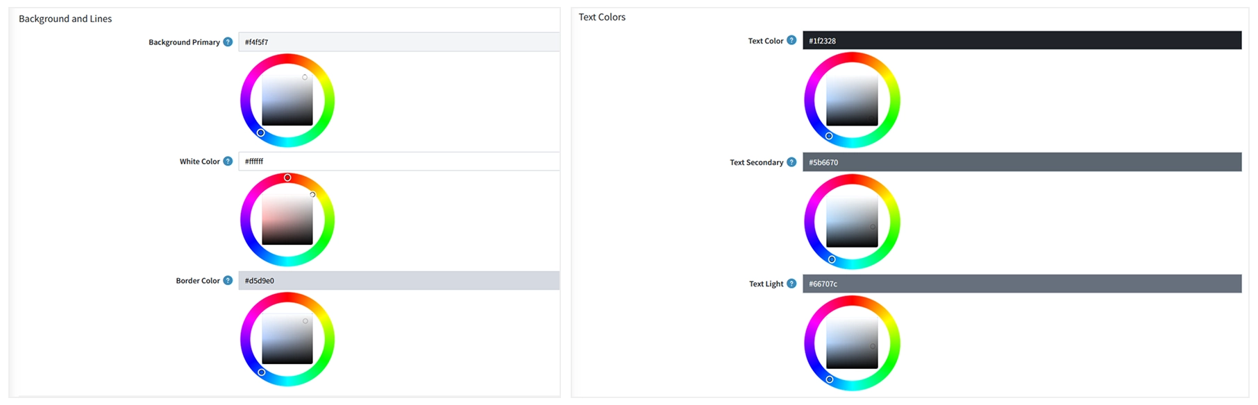
Background and Lines
- Background Primary: Sets the main background color for page sections, panels and subtle container fills.
- White Color: Sets the base surface color for cards, modals, input fields and main content areas. The default is
#ffffff. - Border Color: Sets the color for divider lines, input outlines, table borders and card edges.
Text Colors
- Text Color: Sets the primary color for body text, headings and product titles.
- Text Secondary: Sets a softer color for descriptions, subtitles and secondary details.
- Text Light: Sets a muted color for placeholders, timestamps, captions and disabled labels.
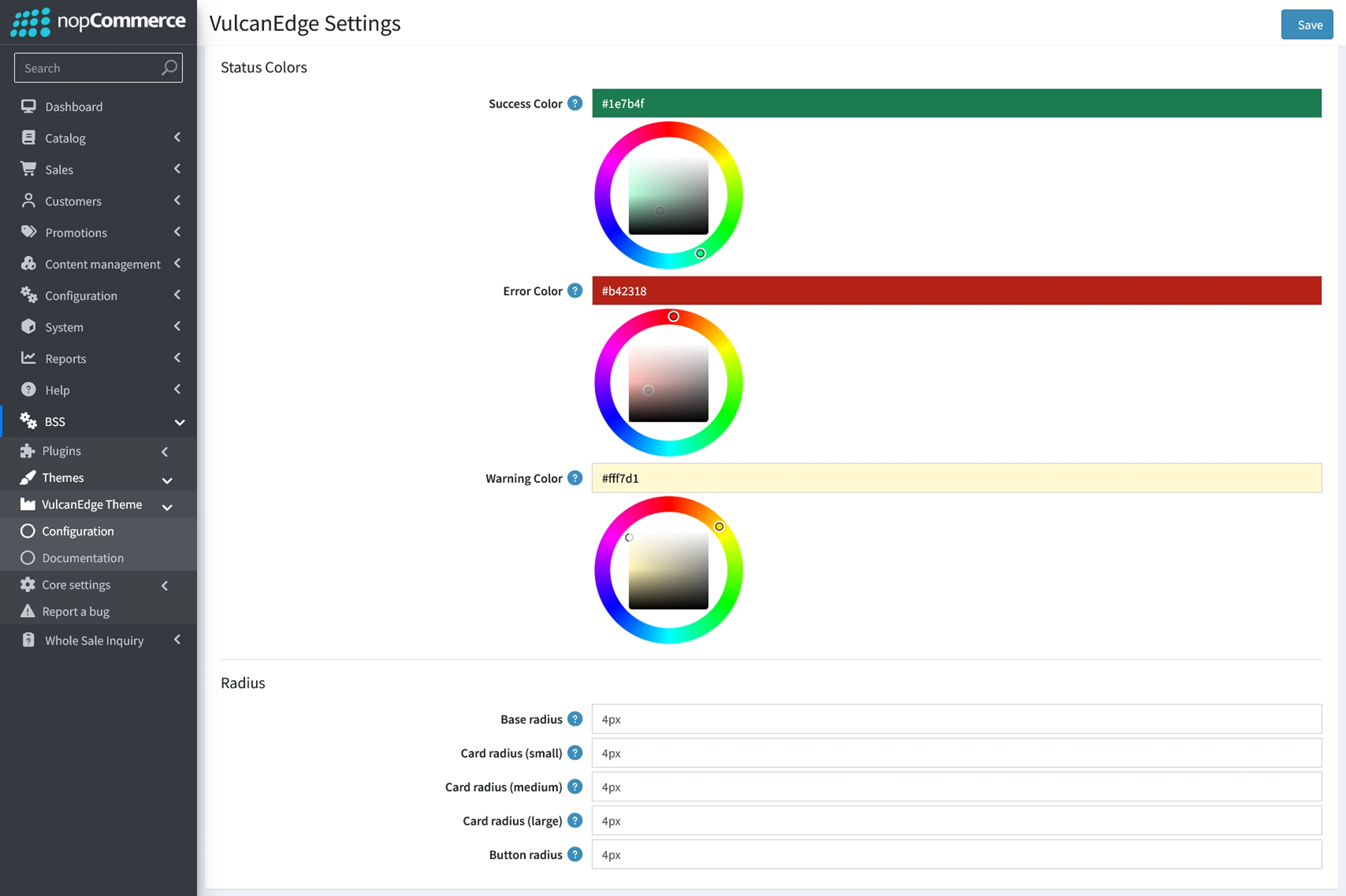
Status Colors
- Success Color: Sets the color for confirmation messages, in-stock indicators and completed order statuses.
- Error Color: Sets the color for form validation errors, out-of-stock alerts and failed action notices.
- Warning Color: Sets the background or highlight color for cautionary alerts, low-stock warnings and important notices.
CORNER RADIUS SETTINGS
Use these settings to control how sharp or rounded storefront elements appear. Enter 0 for square corners or enter a pixel value, such as 4px or 8px, for rounded edges.
- Base radius: Controls the corner roundness of general interface elements, including text inputs, pills, filter chips and icon-only buttons. Standard text buttons use the separate Button radius setting.
- Examples:
0for square corners,4pxfor subtle rounding or8pxfor rounded corners.
- Examples:
- Card radius (small): Controls compact cards, tags, chips and small content panels.
- Examples:
0,4pxor8px.
- Examples:
- Card radius (medium): Controls standard containers, such as product cards on category pages and regular content blocks.
- Examples:
0,6pxor12px.
- Examples:
- Card radius (large): Controls large containers, including hero banners, popup modals and wide promotional sections.
- Examples:
0,12pxor24px.
- Examples:
- Button radius: Controls the corner roundness of text buttons across the store, including Add to Cart, Checkout, filter, dialog and form submission buttons.
- Examples:
0for square buttons,6pxfor softly rounded buttons or999pxfor pill-shaped buttons.
- Examples:
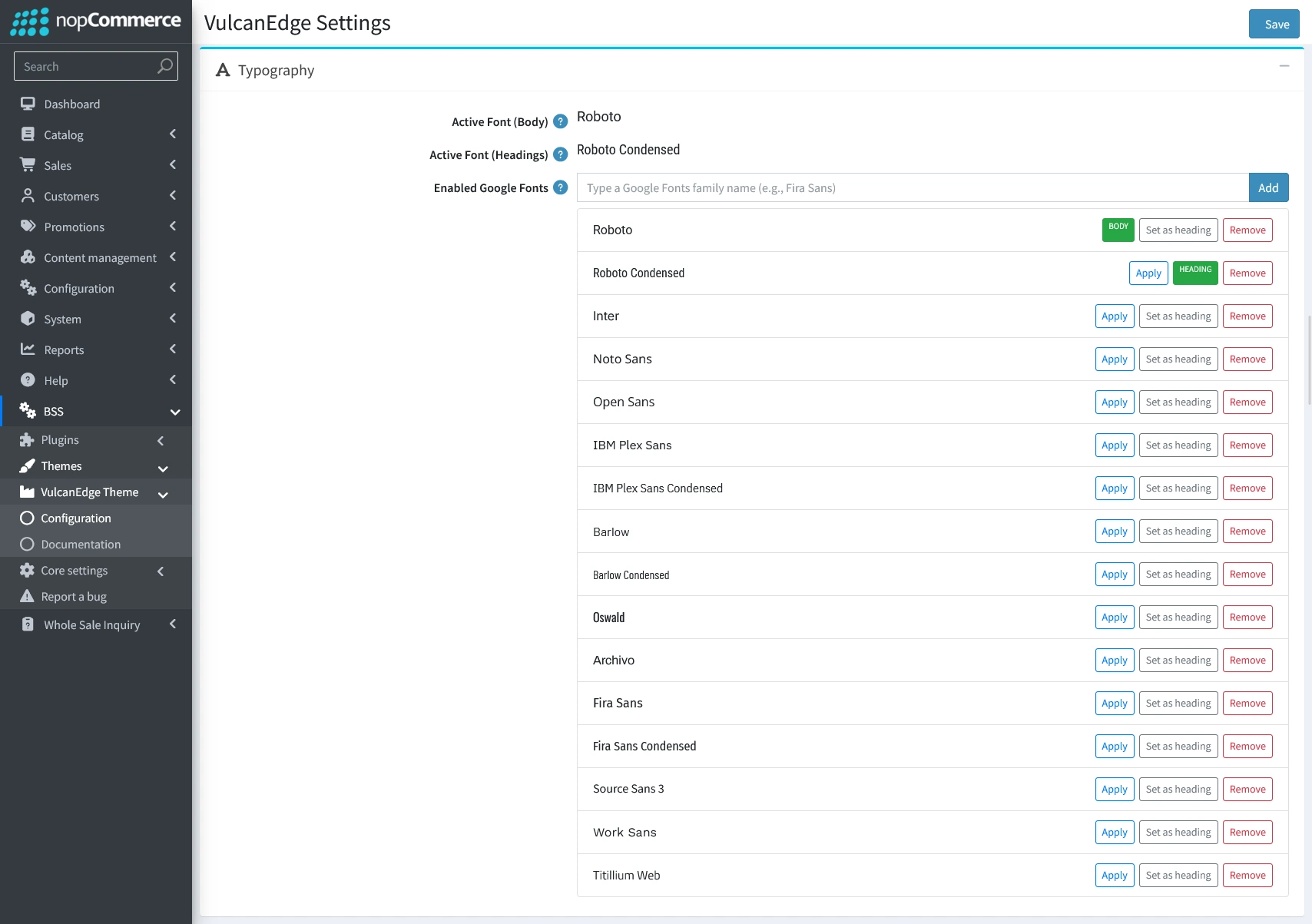
TYPOGRAPHY
- Use the Typography section to manage your storefront's fonts: Active Font (Body) sets the font for body text and UI elements, while Active Font (Headings) sets the font for page titles and section headings—both can be changed from the storefront Theme Builder or by choosing from your enabled fonts below. In Enabled Google Fonts, you can control which fonts appear in the Theme Builder dropdown by ticking them on or off, or by typing a Google Fonts family name and clicking Add
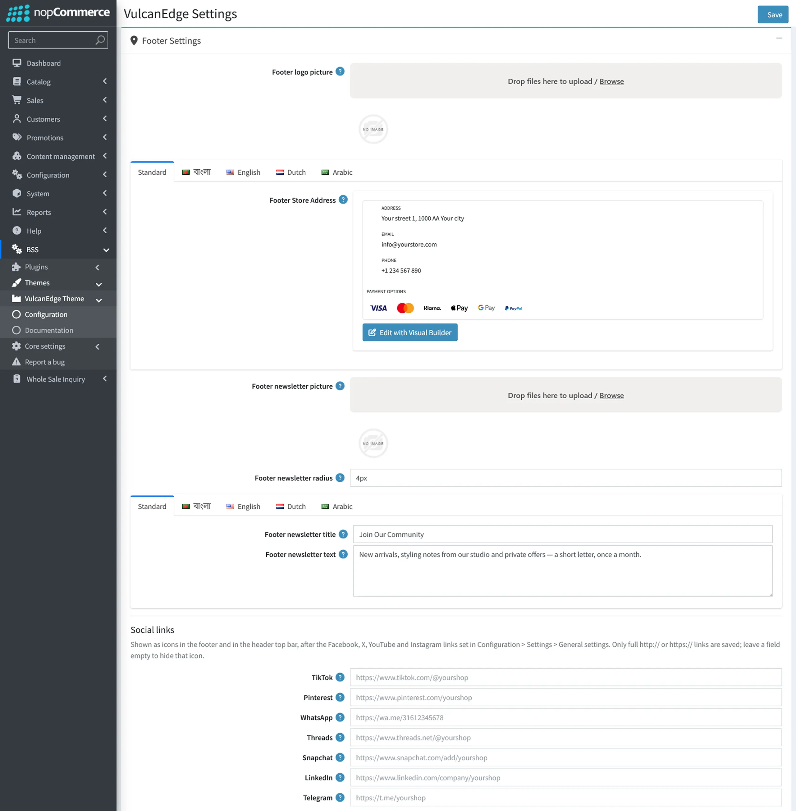
FOOTER SETTINGS
- Logo & Store Address: Upload a custom footer logo (falls back to your main store logo if left empty), and customize your store address, contact information, and payment method icons using the rich text editor or Visual Builder across all enabled languages.
- Multilingual Newsletter Setup: Upload a promotional banner image for the footer newsletter box and set its corner radius independently (e.g., 0, 4px, 12px). You can also customize the newsletter title and short description across multiple language tabs (e.g., Bangla, English, Dutch, Arabic), or leave them blank to hide them.
- Social Media Links: Connect your additional social media profiles including TikTok, Pinterest, WhatsApp, Threads, Snapchat, LinkedIn, and Telegram by entering full http:// or https:// URLs. These icons appear in the footer and header top bar right after your main social links (configured in Configuration > Settings > General settings), and any blank field stays hidden.
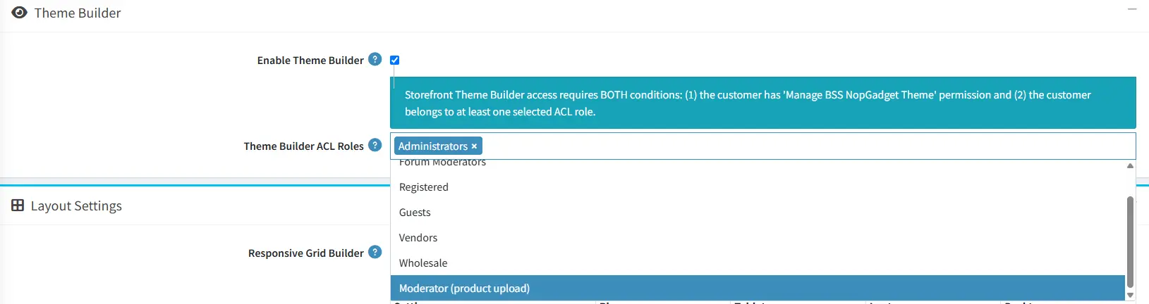
THEME BUILDER
- Enable Theme Builder: Enable the floating Theme Builder panel to customize colors, fonts, and layout settings directly from the storefront.
- Theme Builder ACL Roles: Assign specific customer roles to control who can access and manage the Theme Builder from the storefront.
LAYOUT SETTINGS
- Product image shape: Choose the aspect ratio for product photos across the store, including product cards, galleries, cart, wishlist, mini cart, and menus. Select Square (1:1, default), Portrait (3:4), or Landscape (4:3) to best match your product photography.
- Product image fit: Control how product photos sit inside their card frames. Choose Show whole image to display the entire photo without cropping, leaving a soft background around it if ratios differ, or Crop to fill to fill the frame edge-to-edge by trimming excess edges.
- Product box cart button: Customize the appearance of the Add to cart action on product cards. Choose Filled (default) for a solid full-width accent button, Outline for a bordered button that fills on hover, Text link for a clean underlined label, or Floating icon to display a compact cart icon on the image corner when hovered.
- Homepage category style: Select how category blocks are laid out on the homepage. Department cards (default) displays each department as a band with its subcategories or featured products underneath; Photo tiles overlays the category name on the image; and Editorial places the category name below the image. Items per row and spacing follow your Category homepage layout settings.
- Category picture: Choose which image represents each category in the homepage category block. Select Product picture (default) to pull the image from the category's first featured product or first product, or Category picture to use the image uploaded directly to the category.
- Slider dots: Style the pagination indicators beneath sliders, carousels, and product card image galleries. Choose Bar (default), Gauge, Counter, or Tape. Product box fraction and progress-bar pagination remain unaffected.
- Carousel arrows: Set the placement for previous and next navigation arrows. Choose Beside the title (default) to place them inline with the section heading, or Below to position them beneath the carousel next to the pagination indicators.
- Header layout: Control logo placement in the main header bar on laptops and larger screens. Logo left (default) places the logo on the left followed by the search box and action icons, while Logo centered puts the search box on the left, the logo in the middle, and the icons on the right. The navigation menu always sits on its own row below.
- Button hover: Choose the fill animation for buttons, icon buttons, and quantity steppers on hover and keyboard focus. Shutter (default) drops a darker shade from the top, Shade darkens the color smoothly in place, and Wipe slides the darker shade in from the side.
- Product box frame: Control the border around product cards. Outline (default) wraps each product box in a subtle border that highlights in your primary color on hover, while None keeps product cards open without a surrounding border.
- Customizable Responsive Grids: Configure the number of items per row, spacing, and container widths across various screen sizes (Phone to Desktop), page margin, title size for precise control over your store's visual structure.
Header, Logo & Navigation Settings
- Header message: Enter a short announcement shown at the start of the thin strip above the header, such as Order by 3 pm, dispatched today. Leave it empty to hide the message. Use the language tabs for localized text. The phone number comes from Configuration > Stores.
- Logo width (desktop): Set the header logo width for screens
1200pxand wider, from40to600pixels. Enter0to keep the theme default. - Logo width (mobile): Set the header logo width for screens narrower than
1200px, from40to600pixels. Enter0to keep the theme default. - Menu dropdown: Choose how list menus open on hover. Card shows a compact floating card beneath the menu item, while Full-width panel opens across the header width with links stacked on the left. Grid menus with pictures are unaffected.
- Show 'All departments': Display the All departments button at the start of the menu row on laptop and larger screens and inside the header after scrolling. It lists top-level categories and subcategories from Catalog > Categories, is enabled by default, and stays hidden when the store has no categories.
- Mobile menu style: Choose the phone and tablet slide-out style. Boutique shows the store logo, uppercase top-level items, optional icon classes such as
ri-home-4-line, chevrons, and a tinted open row. Editorial uses large serif text with subcategories expanded and no lines, arrows, or icons. - Menu font: Select the font for the header menu, dropdowns, and simple phone menu. Heading font (default) uses the active heading font at a matching scale, while Body font uses the body font. Boutique and Editorial mobile menus always use the heading font.
- Menu font size: Set top-level menu items on laptop and larger screens from
12to28pixels. Enter0to keep the chosen menu font's default size. - Submenu font size: Set links inside dropdowns and menu panels from
12to28pixels. Enter0to keep the theme default. - Submenu width: Set card dropdown width from
160to480pixels without affecting the full-width panel. Enter0to keep the theme range of220to320pixels. - Menu overflow: Choose how laptop menus behave when items do not fit beside the logo. More menu groups extra items into a More item, while Second row moves the entire menu beneath the logo.
- Menu panel layout: Choose Columns only (default), Columns + spotlight, Columns + products, Image tiles, or Columns + promo zone. Promo content comes from
header_menu_panelorheader_menu_panel_{menu item id}. If products or promo content are unavailable, the category picture is shown. Individual items can override the layout withmm-columns,mm-spotlight,mm-products,mm-tiles, ormm-promo. - Menu panel alignment: Position content with Start (default), Center, or Follow header, which follows the selected logo alignment.
- Menu panel products: Choose featured products, best sellers, or newest products for the category's Products panel layout.
- Menu panel product count: Set the number of products shown in the Products panel from
2to4.
Homepage Featured Products
- Featured products rows: Set how many rows of featured products, from
1to12, appear initially before the Load more button. Only these rows are included in the initial page load. - Featured products rows per 'Load more': Set how many additional rows, from
1to12, load each time a shopper selects Load more.
Homepage Category Text
- Homepage category title: Enter the main heading shown above the homepage category section, such as Shop by department. Use the language tabs, including Standard, বাংলা, English, Dutch, and Arabic, to set a separate title for each storefront language.
- Homepage category subtitle: Add a short supporting line beneath the category heading. Leave it blank to hide the subtitle, or use the language tabs to localize it.

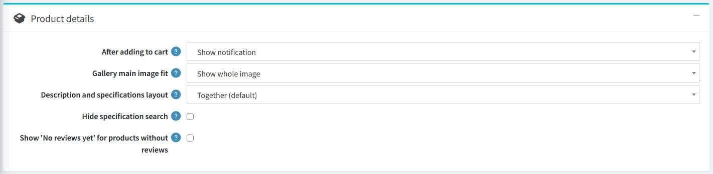
PRODUCT DETAILS
- After adding to cart: Choose what happens on the product details page right after a shopper adds an item to the cart. Select Show notification to display the standard confirmation banner, or Open flyout cart to automatically slide open the side cart panel.
- Gallery main image fit: Control how the main product photo fits inside its gallery frame. Choose Show whole image to display the entire photo without cropping, or Crop to fill to fill the frame edge to edge. Crop to fill trims excess edges so tall photos do not leave empty side bands. Opening the lightbox always displays the full, uncropped photo.
- Product information layout: Choose how the description, specifications, reviews and tags are arranged on the product page. Description beside specifications places those two sections side by side, with specifications shown first on mobile, and stacks reviews and tags below. One section each displays every block in a separate section. Tabs organizes them into one row of clickable tabs.
- SKU and brand position: Select where the product SKU, manufacturer part number and brand name appear on the product page, such as Under the product name. Which fields appear is controlled by the standard nopCommerce catalogue settings.
- Key specs under the gallery: Set how many top specifications appear in the At a glance card directly beneath the image gallery on large screens. Choose Off, 2 specifications, 4 specifications (default) or 6 specifications. The card automatically uses the first items listed in the product's specification table.
- Buy bar: Configure the sticky bar that keeps product pricing and purchase actions visible while shoppers scroll. When set to Beside the configurator, it displays the quantity selector, Add to cart, wishlist and compare buttons from tablet view upward. The purchase card keeps the price lines visible until the shopper reaches the footer.
- Compare table rows: Control the default height of the product comparison block on the product page. Selecting Short, with Show all rows (default) keeps the comparison table compact at first and provides a Show all rows button to expand the remaining rows.
- Hide specification search: Check this box to remove the search filter above the specifications list on both the product page and the Quick View popup. Leave it unchecked when products have long specification tables that shoppers may need to search.
- Show 'No reviews yet' for products without reviews: Check this box to display a clear No reviews yet message instead of empty stars, rating bars and a
0.00score on products without reviews. Products that already have customer reviews are unaffected.
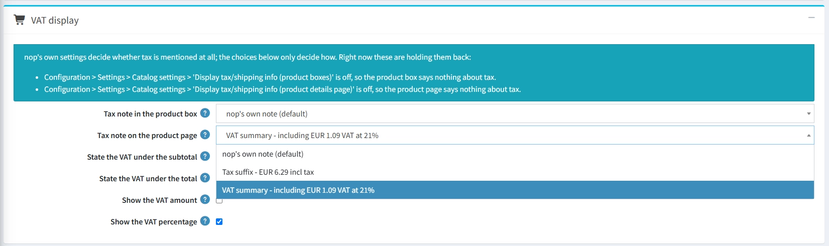
VAT DISPLAY
- Tax note in the product box: Sets how tax information displays on product cards in grids or listings (e.g., standard note, tax suffix, or full VAT summary).
- Tax note on the product page: Controls how tax information is shown directly on the main product details page.
- State the VAT under the subtotal: Adds a small tax breakdown line directly under the subtotal in the cart and checkout—best when only products carry VAT.
- State the VAT under the total: Displays the tax breakdown under the final order total, covering additional taxed items like shipping or payment fees.
- Show the VAT amount: Toggles whether the exact monetary tax value (e.g., including EUR 2.96 VAT) is displayed in the tax note.
- Show the VAT percentage: Toggles whether the tax rate percentage (e.g., at 21%) is listed alongside the tax amount.
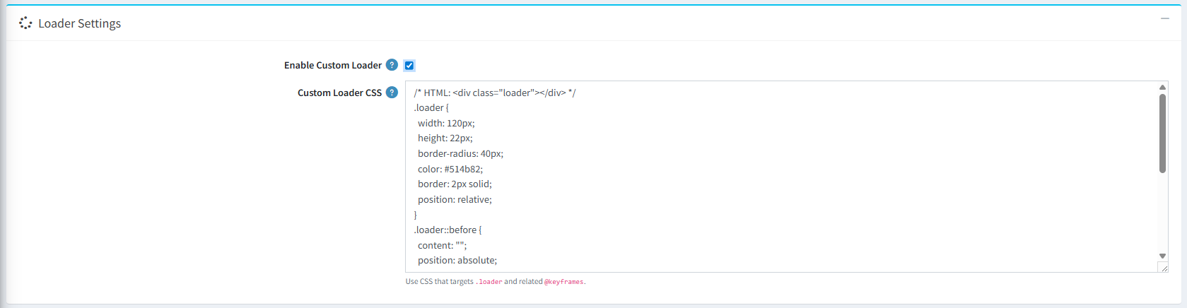
- Loader Settings: Enable loader settings,set loader style (Tengram,Ring, Dots, Pulse) and add your own custom css or use css from any loader site like: css-loaders.com to show customized loader in your site.
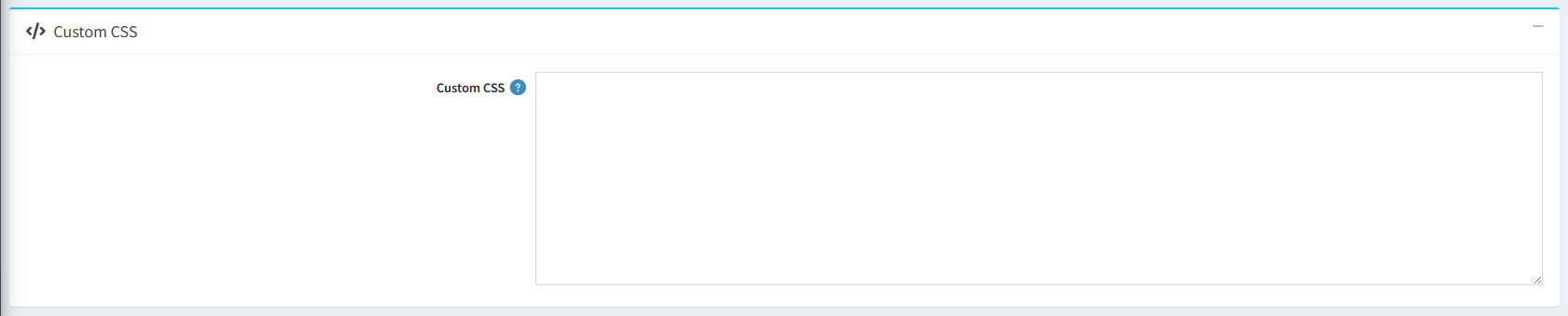
- Custom CSS: You can add custom css to add customize style for your site.
ADDITIONAL PLUGIN CONFIGURATIONS
To give the NopGadence theme a cleaner and more polished look, we have adjusted the default settings of the plugins below. You can review or change any of these settings to suit your store.
Product Box Configuration
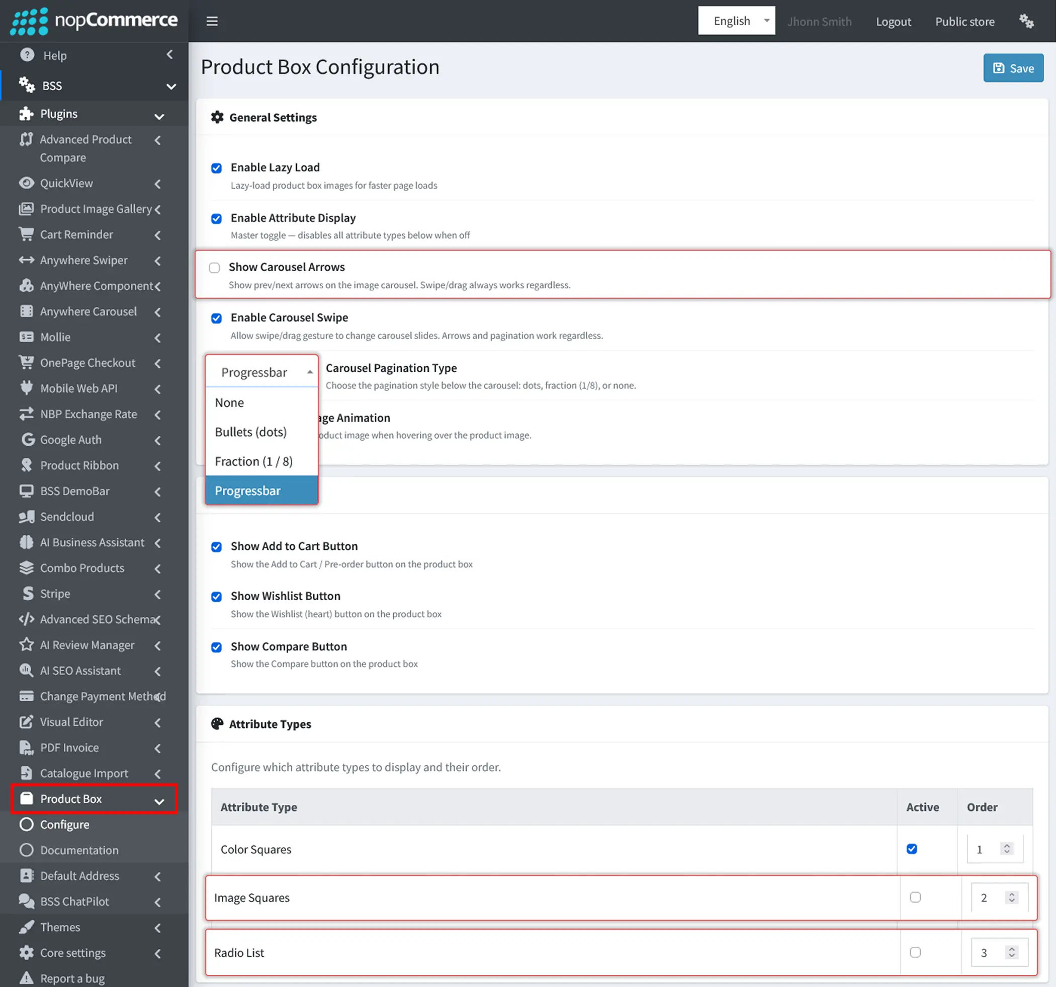
- Go to Administration → BSS → Plugins → Product Box → Configure to manage product box settings.
- Show Carousel Arrows: Show previous and next arrows on the product image carousel. We have unchecked this option for a cleaner look, and swipe or drag still works regardless. Check this option if you want to display the arrows on product boxes.
- Carousel Pagination Type: Choose how pagination appears below the product image carousel. We have selected Progressbar for this theme, and you can switch to any of the following options:
- None: Hide carousel pagination.
- Bullets (dots): Display dots representing each image.
- Fraction (1 / 8): Show the current image number and total number of images.
- Progressbar: Display a progress bar indicating the current carousel position.
- Attribute Types: Choose which attribute types are displayed on product boxes and set their display order. Color Squares is active, while we have left Image Squares and Radio List inactive to keep product boxes clean and compact. Check the Active box next to Image Squares or Radio List if you want to show those attribute types on product boxes.
QuickView Configuration
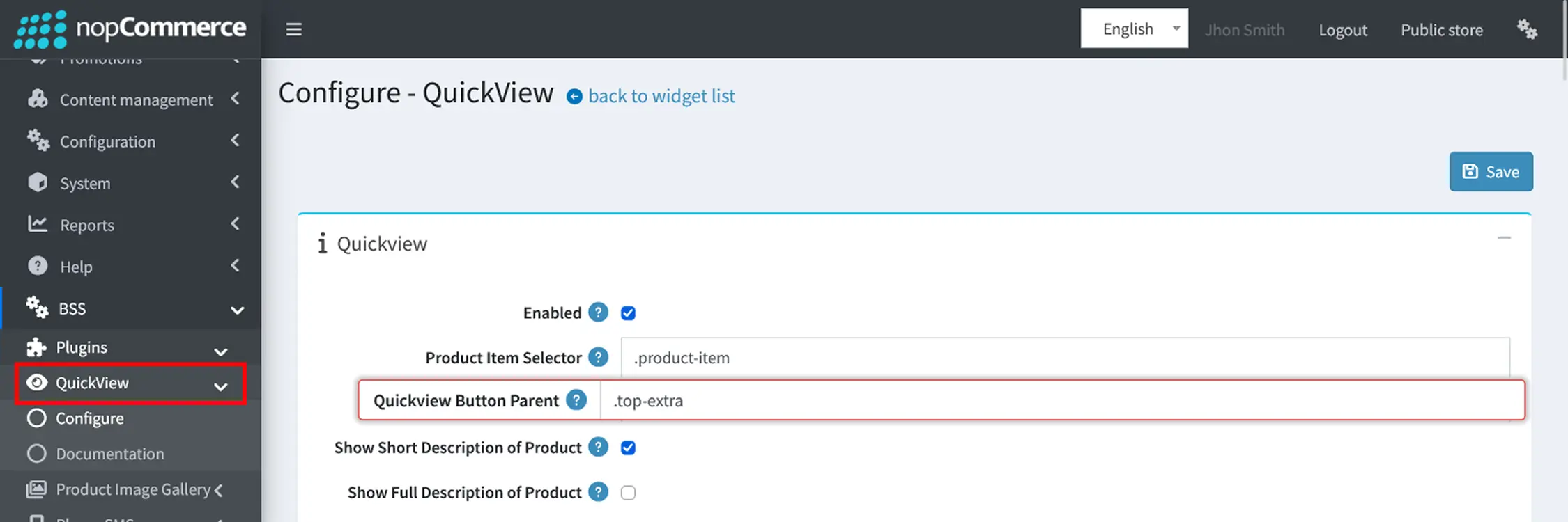
- Go to Administration → BSS → Plugins → QuickView → Configure to manage QuickView settings.
- QuickView Button Parent: Enter .top-extra to place the QuickView button in the product image area. We have entered .top-extra here so the QuickView button appears in the product image area of each product box.
Product Ribbon Configuration
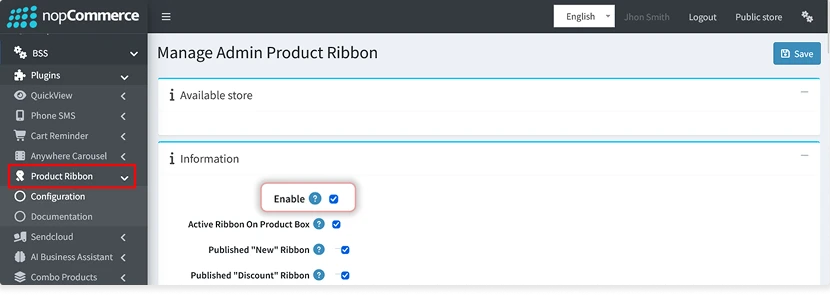
- Go to Administration → BSS → Plugins → Product Ribbon → Configuration to customize product ribbons.
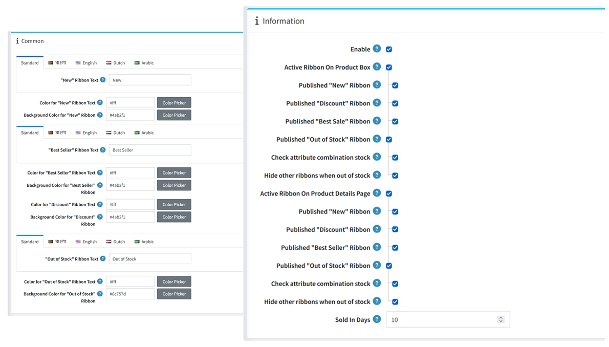
- Enable: Product ribbons are disabled by default. We have enabled them so that labels such as New, Best Seller, Discount, and Out of Stock appear on product boxes. Uncheck this option if you do not want to display ribbons.
- Ribbon Text: Customize the text displayed on New, Best Seller, and Out of Stock ribbons. Use the language tabs to set different text for each language.
- Ribbon Text Color: Choose the text color for New, Best Seller, Discount, and Out of Stock ribbons.
- Ribbon Background Color: Set the background color of each ribbon using a color code or the Color Picker to match your store's design.
To do a clean update, here are the steps:
- Go to Admin > Configuration > Settings > General Settings, temporarily switch the store theme to Default Clean, and click Save.
- Open your hosting/cPanel File Manager (or FTP), navigate to /Themes/ (or \src\Presentation\Nop.Web\Themes\), and delete your installed custom theme folder. Do not delete the Default Clean folder.
- Go back to your nopCommerce Admin and click Restart Application (top-right corner).
- Once it restarts, go to Configuration > Local Plugins, click 'Upload plugin or theme', and upload the updated theme zip bundle and restart the application
- Finally, go back to General Settings and set VulcanEdge as your active theme again.
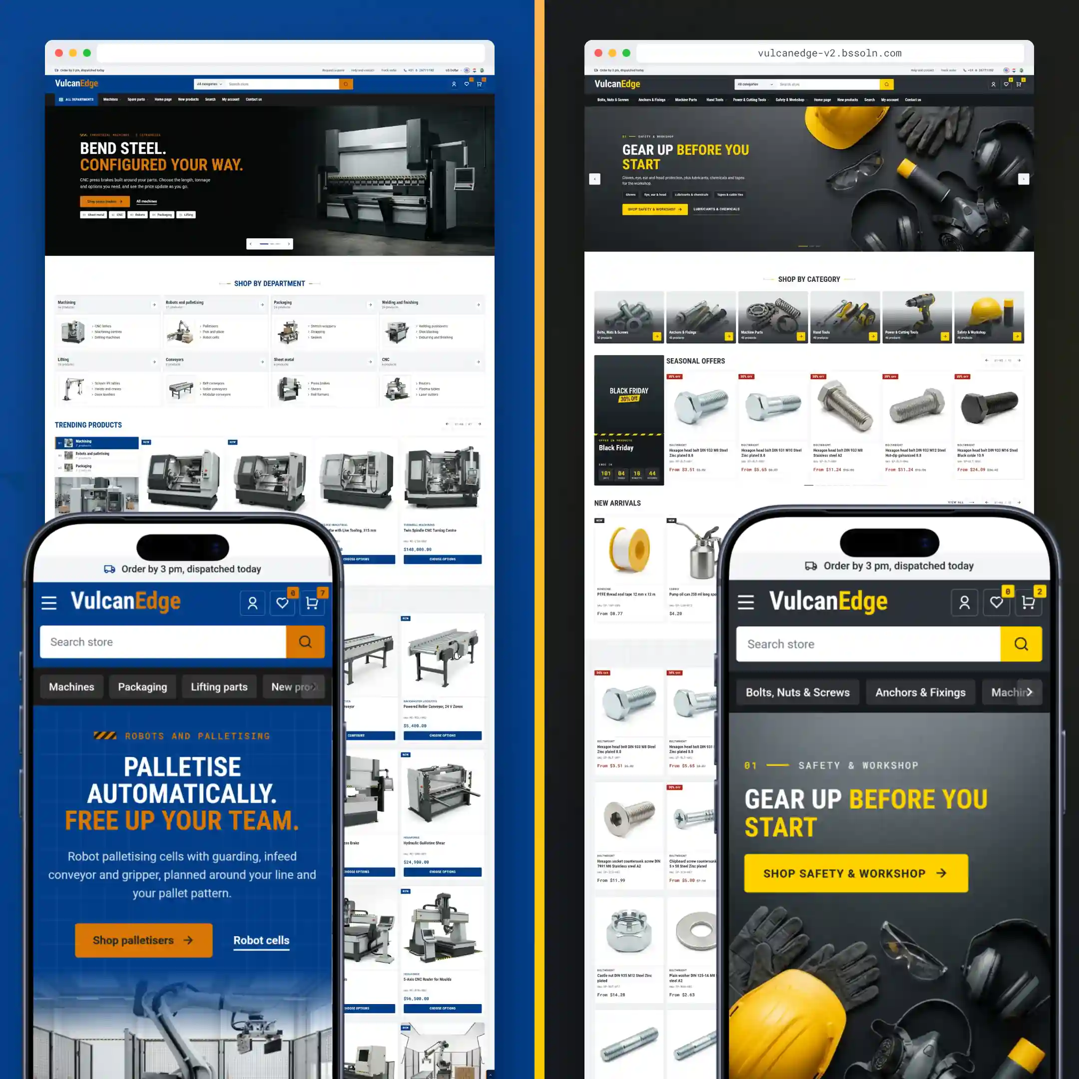
PUBLIC VIEW
PLUGIN CONFIGURATION
- BSS Product Box
- BSS Advance Product Compare
- BSS Anywhere Component
- BSS Visual Editor
- BSS Combo Products
- BSS Payment Change
- BSS Product Ribbon
- BSS QuickView
- BSS Picture Gallery
- BSS Anywhere Swiper
- SendCloud
- BSS Anywhere Carousels
- BSS Google Authentication
- BSS Microsoft Authentication
- BSS One Page Checkout
- BSS AI SEO Assistant
- BSS EU Omnibus Directive
- BSS EU GDPR Cookie Consent